• Beware of Counterfeit Woodturning Tools (click here for details)
  • Johnathan Silwones is starting a new AAW chapter, Southern Alleghenies Woodturners, in Johnstown, PA. (click here for details)
  • Congratulations to Jim Hills for "Journey II" being selected as Turning of the Week for May 6th, 2024 (click here for details)
  • Welcome new registering member. Your username must be your real First and Last name (for example: John Doe). "Screen names" and "handles" are not allowed and your registration will be deleted if you don't use your real name. Also, do not use all caps nor all lower case.

Embellished Bradford Pear Calabash

Michael Anderson

Super Moderator
Staff member
TOTW Team
Joined
Aug 22, 2022
Messages
1,388
Likes
4,054
Location
Chattanooga, TN
Rinse and repeat, rinse and repeat. Once the area surrounding the foot was complete, I burned lines on the side of the foot in a similar fashion as I did the rim: very short and close together. You can also see how the band becomes a bit more refined as the perimeter gets burned.

IMG_6960.JPG
IMG_6962.JPG
IMG_6965.JPG

One thing I would have done slightly differently is to turn a tiny channel with a skew or point tool just inside the unburnt band. This would have defined the edge of the burnt interior just a bit better. It is not a huge deal though, but definitely would have helped keep everything tidier. To clean up the band a bit (and make it slightly more uniform in width, I used 400g sandpaper to remove the areas discolored by the heat. I will probably work this a tiny bit more, but I'm pretty happy with the look.
IMG_6961.JPG
 
Joined
Jan 23, 2023
Messages
169
Likes
229
Location
Calgary, AL
Hi Michael:
Thanks for the detailed dissertation on the pyrography of this bowl - with good examples. This is high on my list of things to try in the New Year. Showing the tips you use for the effects is good for us neophytes who are still trying to decide on a starter kit.
Cheers.
Barry W. Larson
Calgary, Alberta, Canada eh!
 

Michael Anderson

Super Moderator
Staff member
TOTW Team
Joined
Aug 22, 2022
Messages
1,388
Likes
4,054
Location
Chattanooga, TN
Hi Michael:
Thanks for the detailed dissertation on the pyrography of this bowl - with good examples. This is high on my list of things to try in the New Year. Showing the tips you use for the effects is good for us neophytes who are still trying to decide on a starter kit.
Cheers.
Barry W. Larson
Calgary, Alberta, Canada eh!

Thank you Barry! Pyrography is an interesting craft. There are so many devices, tips, accessories available—very overwhelming! I’ve slowly figured out what works and what doesn’t. Like most things, a lot of learning from mistakes. And I definitely made some purchases (mostly tips) that are completely moot now. I’ve also ruined a bunch of tips. But hey, we’re always improving, yeah?
 
Joined
Jun 30, 2008
Messages
172
Likes
212
Location
Chatham, Ont.
These long lines in the interior of the foot are essentially more guidelines, that allow you to burn shorter lines while maintaining the same angle. I filled in the interior with a bunch of long burned lines, and then went around again and burned a bunch of shorter lines to give a crisp texture and a dark and uniform color.

View attachment 58310
View attachment 58311

After the interior of the foot was finished, I went back to the area surrounding the foot. I burned from the foot outward, so that there is an overlap of the burned lines. Once the entire area was covered, it was just a matter of burning in short lines to fill in the texture and color to match the interior of the foot. This is very time consuming, but is also very satisfying.

View attachment 58312
View attachment 58313
Michael, I like how you are putting a lot of effort in preplanning each step so that every aspect is in harmony with the theme. Nice progress!
 

Michael Anderson

Super Moderator
Staff member
TOTW Team
Joined
Aug 22, 2022
Messages
1,388
Likes
4,054
Location
Chattanooga, TN
Michael:
How about "Frosted Mini-Wheats". Just add some strategically placed white acrylic paint....! All kidding aside I believe your bowl looks fabulous!
Cheers.
Barry

Barry, haha, we must be on the same wavelength. The last shreddies bowl, I almost did exactly that. Was going to name it Frosted Chocolate Shreddies. Maybe there will be one in the future! :)
 

Michael Anderson

Super Moderator
Staff member
TOTW Team
Joined
Aug 22, 2022
Messages
1,388
Likes
4,054
Location
Chattanooga, TN
Michael, I like how you are putting a lot of effort in preplanning each step so that every aspect is in harmony with the theme. Nice progress!
Thanks Bernie! I try to have a good plan in mind for these. Otherwise I get too distracted and veer way off course haha.
 

Michael Anderson

Super Moderator
Staff member
TOTW Team
Joined
Aug 22, 2022
Messages
1,388
Likes
4,054
Location
Chattanooga, TN
I reached a milestone today---finished with the pyrography. Woohoo! Well, I may spot check some places, but that's trivial. Today's task was burning the edges of all of the rectangles. Once again, quite tedious. For this burn job I used a finely pointed large skew.

IMG_6978.JPG

This tip lets me get right in the corners of the overlaps. Considering its benefits, the downside is the tip is fairly fragile. Medium heat and a light touch kept it from bending. For the most part, I burned small lines close together to create fairly dark edges. The dark edges enhance the relief.

IMG_6979.JPG
IMG_6981.JPG

I thought for a short bit about calling it quits here. I like the comic book -like appearance the pyrogrphy gives; however, I am going to stick with the original plan of adding some color. So, next step is to paint!
 

Michael Anderson

Super Moderator
Staff member
TOTW Team
Joined
Aug 22, 2022
Messages
1,388
Likes
4,054
Location
Chattanooga, TN
I started painting (dry brushing) the bowl today. I didn't add any color, but rather painted a shadow/gradient undercoat. This will help achieve a better color gradient than applying the color directly to the wood. Normally, as with the Oak version of these bowls, I would coat the wood with shellac or lacquer to seal everything. However, Bradford Pear is fairly tight grained, and the burn lines are fine as well, so the surface is fine to paint on directly. I began by painting near the overlap of each rectangle with Ivory Black acrylic paint (on the "overlapped" section of the rectangles). I like heavy bodied acrylics for dry brushing, as they dry quickly and you can load the brush well. Note: when dry brushing, I strongly recommend inexpensive synthetic brushes. They will get worn quickly, and bristle quality doesn't matter too much. No sense in ruining an expensive brush. Here is a view of just the first layer painted, and then another view of all layers painted:

IMG_7037.JPG
IMG_7040.JPG

The intention with this is not to create realistic shadows, but rather 1) set a dark base from which the eventual color gradient begins/ends, and 2) accentuate the relief. Following this step, I painted with Titanium White on the "overlapping" section of the rectangles. I'm not really trying to create a smooth gradient here, just an opposing brightness. It doesn't have to be perfect, as that wont mater in the end. Here is a shot of the first layer, and then another shot of the entire bowl.

IMG_7041.JPG
IMG_7043.JPG

Following this, I will go back with a very fine brush and the black and white paints to touch up corners, bleedovers, etc... This is part of the process where you have to trust the plan. There's always a bit of "I should not have painted", but once you start adding colors (and many layers...) it all looks great.
 
Last edited:

Michael Anderson

Super Moderator
Staff member
TOTW Team
Joined
Aug 22, 2022
Messages
1,388
Likes
4,054
Location
Chattanooga, TN
Thanks a lot guys! One day I’m going to do a proper frosted mini wheats bowl. I have a pecan roughout that might be perfect. It’s kind of the color of toasted wheat. :)

@Vincent Vogel and @Barry Larson ill do a post about dry brushing technique. No problem—thanks for the ask!
 

Michael Anderson

Super Moderator
Staff member
TOTW Team
Joined
Aug 22, 2022
Messages
1,388
Likes
4,054
Location
Chattanooga, TN
Not a huge amount of progress on the bowl since my last post. I was out of town for around a week visiting both sides of the family (my wife's and mine), and didn't take any wood stuff with me. I'm also working on a swap piece (and follow-along) on the segmenter's forum that is time sensitive (and I'm way late!). That task has taken priority since I've been back home.

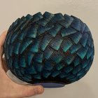
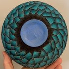
In any case, back to the bowl. I finished detailing the rectangle overlaps with black acrylic paint. I used a tiny brush, and mainly focused on darkening corners and tight spaces. I'm not too concerned with perfection here; rather, leaving a bit of the border unpainted enhances the relief and preserves the "wood look". Once I finished that job, I sprayed the surface of the bowl with a coat of satin lacquer. This serves to seal the paint, and gives me a slightly better surface to add color. I will let the lacquer dry overnight, and do some more painting tomorrow.

In the meantime, I wanted to write a really quick post on dry brushing. Note: I am not a great painter. I'm better than I used to be, but am still lacking. Look at the work of Jacques Vesery and @Donna Banfield to see far better examples of how it should be.

One thing to note about dry brushing--the more layers the better! If you're trying to achieve a rich color and preserve the texture of your surface, it is almost always better to paint multiple thin layers instead a single thick layer. The advantage of acrylic paint (and dry brushing in general) is that your layers dry very quickly. It's not like oil paint where you need to wait a long time, or watercolor where subsequent layers almost always bleed into previous layers. In my experience, if you use a thin layer of paint, you are good to paint the next layer on in 10 minutes or so (this is highly variable though). You can accelerate drying with something like a hair dryer.

Another thing to note about dry brushing is that it is extremely rough on your brushes. I tend to purchase fairly cheap (yet firm) synthetic brushes for this task. Something like the following photo, with the exception of the smallest brush, all the brushes in a pack should cost you around $15 total:

IMG_7147.JPG

The reason this is so rough on brushes is because you are pressing hard on the bristles to remove most of the paint on the palette. Then, when you apply the paint to the piece's surface you use fast and short brush strokes. Often, you will press the brush into the piece at an aggressive angle (up to 90 degrees). Here are two brush heads, side by side. It's pretty obvious which has been used and abused (and not for that long!).

IMG_7146.JPG

For the sake of this post, I painted a quick and dirty color gradient on an offcut, using four different colors. This took me about 15 minutes total. These are likely the colors I will use on the bowl's exterior, though I may add one or two more. I prefer to use heavy bodied acrylic paint. This dries very quickly, so works quite well with dry brushing. If you need something a bit less viscous, you can always add a bit of water or thinner.

IMG_7149.JPG

I used slightly different methods here. For the upper gradient I separated the colors a bit more. I started with the darker phthalo green and painted just the left quarter of the gradient. Then added each subsequent color to the next quarter. I also painted a very thin layer of the lighter pain on top of the previous darker quarter. Lighter meaning whatever was left on the brush after I was done. Barely any. I applied each color twice, and after the second application moved onto the next color. The bottom gradient is not quite as smooth, but is a better example of the depth that you can get if you have larger overlaps. I used the same basic method as above, except I painted around 3/4 of the surface with pthalo green before hand, and added a couple more layers so I had a contrast gradient. Then, I applied two layers of each subsequent color, overlapping about 50% the width of the entire painted surface. Here is a photo of my palette when I was done (really just a fancy way of saying paper plate):

IMG_7145.JPG

You can see for each color I squeezed a small amount of paint out of the tube, and then loaded the brush and brushed the plate until just a little bit of paint remained on the brush. There isn't really a set amount of paint that should remain. I try to remove enough so that aren't any major streaks on the plate. That tells me I have an even load of paint on the brush, and I don't have to worry about getting large splotches on my workpiece. The whisps coming from the black are from the small brush I used to spot paint the rectangle overlap.

Anyway, I hope this was a helpful post for anyone wanting to start dry brushing. It's just a small primer, but feel free to reach out with any questions. Even better, ask them here. I'm happy to elaborate where I can.
 
Last edited:
Joined
Jan 23, 2023
Messages
169
Likes
229
Location
Calgary, AL
Anyway, I hope this was a helpful post for anyone wanting to start dry brushing. It's just a small primer, but feel free to reach out with any questions. Even better, ask them here. I'm happy to elaborate where I can.
[/QUOTE]

Thanks Michael. You might regret suggesting that I ask questions....!
Cheers.
Barry W. Larson
Calgary, Alberta, Canada eh!
 

Michael Anderson

Super Moderator
Staff member
TOTW Team
Joined
Aug 22, 2022
Messages
1,388
Likes
4,054
Location
Chattanooga, TN
I finished with the first three layers of color this morning, two phthalo green and one turquoise. Like the gradients above, I’m working with green and blue tones, but with the added benefit of a black and white contrast undertone. For the first layer of phthalo green, I painted a thin, relatively uniform layer over each rectangle. You can see the different sub tones that come out due to the undercoat:

B5880A41-57D5-4AF1-B980-A92907787A47.jpeg

For the second layer of phthalo green, I focused mainly on overlaying the black, but also pulling a bit more green into the lighter region of each rectangle. This helps to deepen the gradient and make the green a bit more vibrant. The difference is subtle but noticeable:

EA2A6116-371C-44ED-82FC-412FEEDFBD99.jpeg

For the third later I used turquoise. I focused on the border between the dark and light regions of each rectangle. This helps blend the gradient.

3EF63702-F033-4E74-9A4D-C38FAB4C54D0.jpeg
 

Attachments

  • F75A5481-79D6-4D43-98A0-6C1B07927986.jpeg
    F75A5481-79D6-4D43-98A0-6C1B07927986.jpeg
    503.1 KB · Views: 13
Last edited:
Joined
Jan 9, 2021
Messages
24
Likes
21
Location
Strathmore, AB
Great follow along Michael. I'm late to the party, but I finally got here. There is a group of wood carvers that meet weekly in the town I've moved to. Trying to find fellow wood workers and these seem to be a great bunch of guys to hang out with, but difficult to move a lathe to the meeting place. I've never done any carving, but doing some hand texturing and other surface embellishment on a piece would fit the ticket! Mind is working on a bunch of ideas. Thanks for that.
 

Michael Anderson

Super Moderator
Staff member
TOTW Team
Joined
Aug 22, 2022
Messages
1,388
Likes
4,054
Location
Chattanooga, TN
Great follow along Michael. I'm late to the party, but I finally got here. There is a group of wood carvers that meet weekly in the town I've moved to. Trying to find fellow wood workers and these seem to be a great bunch of guys to hang out with, but difficult to move a lathe to the meeting place. I've never done any carving, but doing some hand texturing and other surface embellishment on a piece would fit the ticket! Mind is working on a bunch of ideas. Thanks for that.
Thanks a lot Doug--good to see you over here, and better late than never! :) From what I've seen of your work/skills, I suspect you'll be a natural carver. That sounds like a good time, having a group of carvers to meet with every week.
 

Michael Anderson

Super Moderator
Staff member
TOTW Team
Joined
Aug 22, 2022
Messages
1,388
Likes
4,054
Location
Chattanooga, TN
Sometimes you have to back-track on original plans and change course. As I was about to lay on my next layer of color, I stopped and reflected on my progress. The glimpses of bare wood at the junction of each rectangle kept eating at me. Originally, and like I previously mentioned, I wasn't concerned with the bare wood on the exterior; however, after stewing on it, it just look sloppy. So instead of jumping to the next color, I spent a couple of hours going over the edges of each rectangle--a tedious task, but well worth it. For this I used a very small detail spotter brush (size 5/0). This size of brush is great for painting really small features, as the bristles are only around 1 mm wide. To keep everything crisp, I cut the edge at an oblique angle. I neglected to take a photo beforehand, but the following is a photo of the brush after I was finished. A bit disheveled, and I will likely trim again before I use it next.

IMG_7201.JPG

Instead of acrylic paint, I used India ink for this step. It is much less viscous than the paint, so it can absorb into nooks and crannies easier. Following the application of India ink, I sprayed a coat of satin lacquer to seal the surface of the bowl. You should be able to see an obvious, and in my opinion much improved, difference in the following before/after photos.

IMG_7193.JPG

IMG_7200.JPG

There are still a few tiny spots to ink over, and I have not yet touched the bottom border yet. One of the final steps of this bowl project will be to go over the rim and the area surrounding and within the foot with a layer of India ink. I'm saving this for last, so I don't have to worry about blemishing the dark surface with paint. Anyway, I will let the lacquer set overnight, and will continue with more color layers tomorrow. Onward!
 

Michael Anderson

Super Moderator
Staff member
TOTW Team
Joined
Aug 22, 2022
Messages
1,388
Likes
4,054
Location
Chattanooga, TN
Today I added several more layers of paint. I started with a layer of turquoise, and then added two layers of teal. This gave me a pretty nice dark-light (contrast) gradient; however, the phthalo green got fairly covered up. So, I went back and added another layer of phthalo green, moving from the dark region to around the halfway point of each rectangle. Afterward, I added another layer of teal to blend the edge of the green and to further increase the contrast. I finished with another coat of satin lacquer, which I will let set overnight. Tomorrow I will add an even lighter color, aqua green, as well as some more white at the very edge. I’ll also add more layers of the same colors as needed. If I have time, I will also darken the rim and foot region with India ink. The end is near!

Here are two photos. The first is the bottom of the bowl after the first layer of teal, and the second is the current state. The difference overall isn’t super dramatic, but you should be able to see in the second that the gradient is much smoother and there is quite a bit more depth of color.

7515125A-50DF-476B-AD4D-078F86B5D303.jpeg

A9DF957E-BC11-4566-A2BB-0F820B835DA7.jpeg
 
Joined
Jun 5, 2023
Messages
124
Likes
700
Location
Portage, MI
Today I added several more layers of paint. I started with a layer of turquoise, and then added two layers of teal. This gave me a pretty nice dark-light (contrast) gradient; however, the phthalo green got fairly covered up. So, I went back and added another layer of phthalo green, moving from the dark region to around the halfway point of each rectangle. Afterward, I added another layer of teal to blend the edge of the green and to further increase the contrast. I finished with another coat of satin lacquer, which I will let set overnight. Tomorrow I will add an even lighter color, aqua green, as well as some more white at the very edge. I’ll also add more layers of the same colors as needed. If I have time, I will also darken the rim and foot region with India ink. The end is near!

Here are two photos. The first is the bottom of the bowl after the first layer of teal, and the second is the current state. The difference overall isn’t super dramatic, but you should be able to see in the second that the gradient is much smoother and there is quite a bit more depth of color.

View attachment 58859

View attachment 58860
Wow Michael this has progressed beautifully! Every time I see phthalo green I think of Bob Ross... :cool:
 

Michael Anderson

Super Moderator
Staff member
TOTW Team
Joined
Aug 22, 2022
Messages
1,388
Likes
4,054
Location
Chattanooga, TN
I did a little bit more work on layering colors. I added a couple of layers of Bright Aqua Green to the light regions of the rectangles. This color is subtly brighter than Teal, and is the last color I will add.

7706AAB2-B6A1-4C72-B7FC-F79638BBFC69.jpeg

After these layers, I went back to Titanium White and lightly brushed the edges of the rectangles to really enhance the overlapping effect and to establish a maximum brightness border. The change is pretty dramatic, I think.

F957DACC-3994-4FC5-BC7B-863A5F0C8DB2.jpeg

Following this, we enter into the “marginal gains” part of the dry brushing process. I will continue layering until I’m happy with the gradient. I’m likely going to start with a bit of Ivory Black to refine the shadows, then some Phthalo Green to add back in some more green, and then a bit more Teal to blend. Once that is done I will work on darkening the rim and foot region. That will be where the next update happens.

The end is near—shooting for tomorrow. Whew!!
 

Attachments

  • 54324E04-DB96-4AAF-8B11-3F4EEC2C2AA4.jpeg
    54324E04-DB96-4AAF-8B11-3F4EEC2C2AA4.jpeg
    556.7 KB · Views: 10
Joined
Jan 23, 2023
Messages
169
Likes
229
Location
Calgary, AL
After these layers, I went back to Titanium White and lightly brushed the edges of the rectangles to really enhance the overlapping effect and to establish a maximum brightness border. The change is pretty dramatic, I think.

Very nice. The white give a real 3-D look. Like a frost rind.. looking forward to the finished product.
Cheers.
Barry
 

Michael Anderson

Super Moderator
Staff member
TOTW Team
Joined
Aug 22, 2022
Messages
1,388
Likes
4,054
Location
Chattanooga, TN
The last steps in making this bowl were to refine the shadows a bit, darken the rim and the foot area, and sign my name. I used painter's tape to mask off specific rectangles/regions where I needed to apply a bit more Ivory Black. These were areas that got lightened with the Teal/White addition to the edges of the rectangles.

IMG_7247.JPG

After this was finished, I did a few minor touch-ups, and then focused on the rim/foot. I masked off the bottom rectangles, and added a couple of coats of India ink. For the rim and the center of the foot, I did not mask off anything so it took a lot of focus to not contaminate the surrounding areas.

IMG_7251.JPG

Once the India ink was dry, I masked the bare wood ring on the bottom of the foot, and sprayed the exterior of the bowl with clear satin lacquer. After the lacquer dried, I engraved my name, the year, and the type of wood on the foot ring. I like to leave a small section of the wood natural (in addition to the interior), as it makes for a nice surprise feature. I really like using a small engraver to sign my pieces.

IMG_7258.JPG

Kelly Dunn turned me onto this, and with a few exceptions, I haven't used anything else since. The sharp point of the engraver tip allows me to keep the information small and finely detailed, more so than even a micro-tip pen. It does take a steady hand though, and neat handwriting (still working on this one).

IMG_7257.JPG

The above photo is pre-oiling. Once you add oil to the wood, the engraved section really stands out with a lot of contrast. I coated this with hemp oil, and added another treatment of hemp oil to the interior. All of this work was done yesterday, and this morning I took some gallery shots. Which means.....the bowl is finished!

I'll post final photos of this bowl to the gallery later today (and link them here). To everyone that followed along with this process, thanks a lot! Doing a follow-along definitely adds quite a bit of time to the process; however, it is pretty enjoyable writing about the process and documenting with photos. It gives you time to reflect on improvements, mistakes, alternative methods, etc... There are a few things I will change/fix with the process to make the next one even better:
  • Turn a v-groove on the underside of the foot to better define pyro boundary.
  • Prior to dry-brushing, ebonize the entire exterior of the bowl
  • Be more thoughtful with carving steps and laying down colors during painting
  • Consider alternative painting methods (incorporate some watercolor and/or airbrushing)
The above things mostly relate to being more efficient in the process. I'm very happy with the outcome, but this is just a stepping stone to grander things. I think. Isn't everything? Anyway, If you made it to the end of this post, I hope you enjoyed the process. Feel free to post here or reach out privately with any questions or comments. Cheers!

Michael
 
Back
Top