• January Turning Challenge: Thin-Stemmed Something! (click here for details)
  • Conversations are now Direct Messages (click here for details)
  • Congratulations to John Lucas for "Lost and Found" being selected as Turning of the Week for January 13, 2025 (click here for details)
  • Welcome new registering member. Your username must be your real First and Last name (for example: John Doe). "Screen names" and "handles" are not allowed and your registration will be deleted if you don't use your real name. Also, do not use all caps nor all lower case.

Gradient Photo Paper

Joe....when you mask your object in these digital processes remember to feather the mask. It will make the object look less like it was actually cut out of something and more like it was shot in place in front of the background. It will make it look more natural in other words.

For most types of bowl shots you will find a degree of feathering that works fine and can be repeated with little effort on future shoots.

It is important to have good soft lighting that avoids harsh highlights on the objects, but just enough so there is some sense of the directionality of the light. You don't want it shot so the lighting is too flat.

And lastly, work on creating some soft shading. Most work shot in front of a gradient will have a soft shadow. You can replicate this in Photoshop. Again, once you have the process it is very quickly repeatable for future shots.

A good third party manual on the version of photoshop you are using can help a lot. There are some specific books focusing on photoshop work for object/art/hobby photography that can give you some nice repeatable methods that look very natural. These books vary a lot in how they are written and approached. It is not a bad idea to plop down on the floor of your local bookshop and look at each of the available books and see who's approach is the most accessible to the way you think.

Of course, by the time you have shot the object with good lighting in front of a solid background or blue or green screen you could easily have done it with a gradient background as well. But, by going digital you wont have problems with worry about damaging the gradient screen (or uncurling it <grin>), and you will have a whole range of backgrounds you could apply digitally.

What do I use? A gradient sheet. But I will use a solid screen if I want to do something different.

Keep in mind that some galleries/juried exhibits might object to digitally manipulated images if you are thinking in those terms.

Dave
 
David, I have been using Photoshop for almost 15 years (it is celebrating its twentieth anniversary this year) and my experience is that woodturning should be shot in their desired setting. A good job of "shopping" an image is never as good as the real thing and although a highly experienced Photoshop user can come up with some creative effects, they are generally not appropriate for the purpose of shooting woodturnings.

You mentioned shadows and they are important in providing perspective and depth in an image. They are also something rarely done well. A case in point is the most recent issue of American Woodturner that had me wondering what the heck were they thinking. There are some pages with painfully obvious examples of terribly unrealistic shadows. If the items were not available for properly photographing, they should have just left the shadows off rather than mutilating the images. Maybe it was not noticeable to the average person, but it stuck out like a sore thumb to me. I think that it is the publishing company that is responsible for the graphical layout and I guess that is what happens when we go with the low bid.

Blue screens have their place -- in video. Video images deliberately have a certain amount of blur -- otherwise images would give the appearance of a bit of jerkiness in motion. Blur smooths out the jerky motion. This blurring also helps to feather the transition from foreground to background. I can't think of any particular good use for blue screens for normal photography although I am sure there must be some who find a use for it.
 
Bill,

Sorry...I reread what I wrote and didn't say things well. I was responding to Joe's first attempts at digital and trying to give him some hints at making the results more realistic. I agree with you that a piece shot in place with good lighting is the preferred method. I think I did mention that was what I use personally.

Sorry for not being clearer.

You can get good results from a digital background, but it takes time and playing, and it is rarely as good as a good, well shot piece done naturally.

You have me curious to see that issue of AW. Mine are all held at home till I pass through there so it will be a while.

Dave
 
It depends on what you are doing with the photography of your piece. I shoot a lot of juried slides and one thing I try very hard to do is to now show off the photography. By that I mean that you should see the work clearly and not be aware of the photography. That means that if you make the background too fancy or if the piece is floating in space it can make the juror look at that. They often only have 15 to 30 seconds to look at all the images to make decisions on who gets into a show. Anything you do that can detract from them looking at your work is not a good thing.
I took a background out once because a customer asked. We never did get the shadows to look right. It always looked fake. In this day of photoshop you really don't want a juror to think you retouched your work. They might think you've touched up a crack or bad spot.
I've been able to get a lot of people into good shows and have had compliments from jurors on the photography of their work. I do use faded backgrounds because it adds depth to the images but I try not to make it too theatrical. That is unless it's art glass. For some reason I can get away with much more dramatic lighting and backgrounds with glass. Don't know why that is.
 
OK I have gotten my paper to relax and handle relatively nicely now or at least to the point I can work with it.

My next question is how do you all hang the paper or prop it up so that it has that natural curve to it?? Any photos of your set ups would really be worth a 1000 words. I had gotten the white to black paper so when photograghing on it how close to the transition area do I need to place an object??? Also if I were to photogragh a small object like a pen would it be better to use the black section or the white section or something in the middle??? Probably will be shooting from the top or right over it. With larger objects are you shooting straight on, bottom up or slightly top down??? In other words what angle should the camera be at in relation to the object??? Thanks.
 
John, I hang my backdrop inside my photo cube/tent with binder clips and rare earth magnets at the top, and fridge magnet clips at the bottom.

Inside top:

Photo Tent - 03 800.jpg

On the back of the cube, stuck to the binder clips:

Photo Tent - 04 800.jpg

And on the front edge, to hold the bottom in place:

Photo Tent - 02 800.jpg

I have a 12 x 12 x 3 box that I put under the backdrop to raise the level to match the front opening of the cube. That elevates the piece I'm photographing enough to get a good profile shot.
 
It was only a proof-of-concept experiment, mates. And I agree there's no match for the genuine article.

The front cover of the Journal looked OK to me, but the next two pages had me scratching my head too.

Thanks for bringing us back on topic, JT & V.
 
John I don't have photos of my setup since it's stored in a box right now. I prefer to have the back ground seperate from the booth so I can control the sweep. I do this by adjusting both the height and how far back it is from the booth.
I do this with 2 pieces of thin wall conduit stuck in gallon buckets full of concrete. I have 2 pieces of PVC that fit over these. They are connected with elbows to a cross piece. Non of it is glued so that I can disassemble it. The back ground is clamped to it using spring clamps. The height is adjusted using spring clamps on the conduit.
I shoot on my table saw so the pipe stands sit behind it. If it's a small piece and want the horizon line lower I lower the background and move it back. This changes the curve of the back ground and moves where the faded horizon line crosses the piece. Since my table saw is in the middle of the room I have more room to move my lights and can put cardboard between the lights and the background to shade it to make it darker.
I can get a real good fade using plain seamless paper by shading it and moving the background back further from the subject. It's difficult to get white to fade to black which is where the graduated backgrounds come it. I can get Thunder gray to fade to black very easily. If I can use some light behind the subject I can get the foreground of a black seamless paper to go much lighter and get the light to black transition but it usually puts a shadow in front. Used properly this is still a good technique. Here's an example. In this case I used a small reflector light up above without the top panel of my photo booth. I put a light through a panel on the left side to fill in the front of the piece. The background was about 4 feet back and shaded from the fill light as best I could.
 

Attachments

  • mirrors-1216.jpg
    mirrors-1216.jpg
    40.5 KB · Views: 22
John T.,

I am supposed to be writing an article for our club's newsletter and plan to have some pictures to show the set up. I was planning on shooting a few pictures this afternoon, so hopefully I will get a "round tuit" and actually get this finished. When I do, I will post a shot showing how I hand the background paper. Meanwhile, I have a sketch in post #6 of this thread showing approximately how I curve the background. My objective is that there is not a sharp bend anywhere because I do not want a strong horizontal line running through the object being photographed. I place the turning close to the front edge of the background. Paraphrasing what John L. said: it is about the turning and not the photography -- but, the photography has to be good enough that it will not be what is noticed first.
 
OK I tried out my paper today and I need to work on the lighting and all but this stuff might be worth it after all. Thanks everyone.

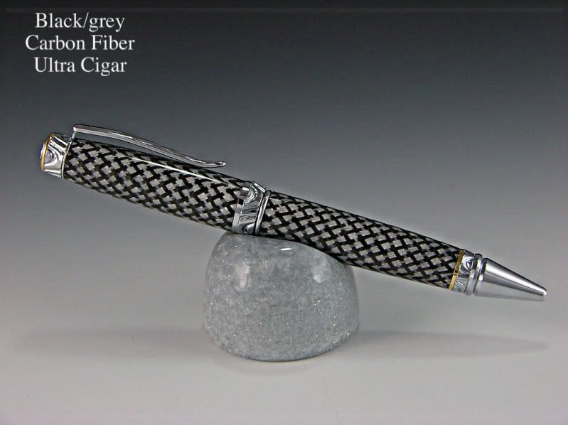
By the way this is a kit called an ultra cigar and I casted a black/grey carbon fiber material for the blank. Thanks for looking.


IMGP0543.jpg
 
John Not a bad photo. To get it to fade more you will have to shoot at a lower angle. The background is simply too close to the pen to allow the light to fall off and get darker. Even if you have a fade background the fade part is usually too subtle when looking at a small area. Of course for a dark pen you don't want the background too dark.
try using a brighter light on the top of the booth. You might be able to do this by just moving the light closer. It will produce a stronger shadow on the front. This will create a slightly brighter top and the shadow will wrap around the pen which will give it more shape. The photo won't look so flat.
I have a table top shoot this morning. If I have time I'll set up a pen and some panels and shoot it to see if I can show you what I mean.

Ok I will play around some more. The one thing I will try is moving the pen more toward the front of the paper. I placed it closer to the shaded grey because I did not think the back would show at all. I do not have a photographic eye so I am not sure what I am looking at. Probably if I had examples it might help abit. I did have the light on top in the back because I thought I read you need to light the backside up also. I will try to move it forward. I have to remember to charge the battery for the camera. Had just enough to take this shot yesterday. Thanks.
 
Not sure what I did. I wrote a great reply and then hit the wrong button and lost it. Here goes again.
I move the top light slightly to the rear and closer to the top panel. Move the light until it highlights the top of the pen nicely and cast a shadow where you think it will look good. In this case it was back and to the right. I put a fill light on the left and moved it back far enough so that it was not as bright as the top light. You might be able to do that with a fill card instead of a light. I shaded both lights so that they were not hitting the back ground. This was a Thunder gray background hanging about 5 feet back with a gentle curve all the way to the front.
The idea is to make the top of the pen just a little brighter than the front and bottom so that you have more shape. It really should not look much different than the photo you did just a little more 3 dimensional.
sorry for the lousy pen and props. It's all I could come up with at the last minute.
 

Attachments

  • pen.jpg
    pen.jpg
    9.3 KB · Views: 34
John T, I like the work that you did. It is very nice. I think that John L. had some good helpful suggestions. The shadow seems to be diffused but perhaps still a bit strong. I think that I would either have the lights reflecting off a couple umbrellas or shooting through diffusers.

In your post processing of the image, it appears that the sharpening (or perhaps contrast) is a bit too much. This is based on the rather strong halo around the pen. The ideal situation is to sharpen an image and not have the sharpening noticeable. If you are using Photoshop, I could help with sharpening, but each software application is different and your's may be doing it automatically. I would say that you have made tremendous strides in photographing turnings.
 
Not sure what I did. I wrote a great reply and then hit the wrong button and lost it.....

I know about the dreaded "great reply filter" 😉

Now, I try to remember to save things to the clipboard. I have had my browser suddenly go "poof" and vanish into thin hyperspace more than once. Some of those posts are probably on their way to the Andromeda Galaxy.
 
Thank you Bill and John.

I am using "Picture It" and basically to size (reduce) the photo. I do have PhotoShop3 that I have used a little bit but it is too complicated for me. I did an animation trick once with it.

Now when I say I do not have a photogragh eye, I am not kidding because I look at John's photo and think it is too dark to show off the highlights of the wood. I do need to play around abit more but at least the photo did take a step up and that was due to the paper. I do not see the halo that you mentioned, Bill. I will play with the lighting more. I may try to make some stands to hold the lights I have. I have a couple stand lights and they are OK but very cheap. I tried using some of those clip on lights and can not position them very well. I will continue to play with them as I post photos of more pens I made. Once I learn what the heck I should be looking for it may come abit easier. 🙂
 
I was just thinking to myself. Maybe I will try facing the pen on more of an angle to give it a depth feel to it instead of looking at it from straight on. Thinking out loud. Sorry. 🙂
 
My guess is that Picture It is doing so automatic sharpening. The halo is not really objectionable and most people probably wouldn't even notice it. I hope that you do not mind that I edited your image to show the halo that I was referring to. Images are sharpened usung a technique that goes by the unlikely name, "unsharp mask". Unsharp mask is a fine tool, but has the undesirable characteristic of not sharpening edges the same. It sharpens high contrast edges the most and basically ignores low contrast edges -- and that is sort of the opposite of what we would like to get when sharpening edges.

So what does it look like? Unsharp mask increases the contrast of edges by making light tones lighter and dark tones darker. Looking at the image on the left below, we can see that the light gray background shows a a lighter band surrounding the pen that sort of looks like a glow or halo. At the same time, there is a less noticeable dark line running along the upper edge of the pen. Notice that the halo is less noticeable on the bottom of the pen because the contrast is lower.

I did a bit of editing to the image on the right to remove the light half of the halo, but the dark half would have been too difficult to try to remove.

cigar_pen_final.jpg

The following is not really necessary, but I am just showing it as an example of a different sharpening technique (unfortunately it is not automatic and requires a lot of manual tweaking in Photoshop):

After I removed the bright halo, I actually added back some sharpening using unsharp mask, but in this case, I modified the sharpening so that it was mainly applied to the less contrasty edges. I also created a mask so that sharpening was only applied to edges and not the entire image.
 
OK Bill. I looked at your photo and still do not see a halo but I will take your word for it because you know what you are looking for. I do see that yours looks even sharper and brings out the 3D effect even better. OK now and I know I am being a pain but you brought it up, if you could find some time maybe you could write me up a procedure to touch up my photos in whatever program is easier and I can apply that and maybe that would help me achieve a better photo. You could send it to my email address if you would like. jttheclockman@aol.com . I am not sure how many people we are boring here with this. I would also like to have seen the entire pen photo done using your method if that is possible and see them side by side. Would using your method still tell me I need to adjust the lighting????

Using John's example I thought the idea was to try to eliminate shadows but I see he trys to use them. The top of his pen looks washed out with the light source and the side of the pen gets too dark to actually appreciate the grain of the wood. Is it that a pen is too small of an object to do some of the photograghic things you can do with larger objects??? Or is this the look I should shoot for??? Thanks again for all the help.
 
John Your computer screen may be darker or more contrasty than mine. On my screen the top is bright but still has detail. The front of the pin is just a hair on the dark side but has good detail and color. Of course we each see things differently and would have shot the pen better if I had more time. That was really a rush job because the morning work took longer than I had hoped.
I do use shadows. We went through a spell where all the people who were lecturing on juried slides were saying no shadows. I used them and everyone kept picking my slides as good examples of what a shot should look like. What I found out was this was a mantra carried over from the on camera flash photos often turned in by artists for their slides.
There are good shadows and bad shadows. A good shadow ads shape to the piece just like a good highlight. A bad shadow is too dark or pulls your eye away from the main piece. A bad highlight is the same, it has little or no detail and since your eye tends to go the lightest parts of an image first it can be distracting if not done correctly.
I won't say I hit it every time because every piece I shoot is different and time contraints (read that money the customer is spending) is always a problem so I often have to leave them a little less than I would really prefer.
The fact that your asking questions means that you will eventually find answers. First you have to recognize the problem, then you can find a solution.

John thanks for the explanation and your last statement is right on the mark. I am trying to recognize the problems so I know what to look for. I know I will not take perfect photos because I do not have a good camera and photo equipment and frankly the time but at least the photo will have improved and I can be happy with it. If I were having a piece in a magazine I would need a professional shooting. This is just for fun and eventually hope to make a web site. I do appreciate the time you guys have given my posting. Thanks and have a great day. I am now going to a woodworking show and buy some new toys. Yea....
 
OK Bill. I looked at your photo and still do not see a halo but I will take your word for it because you know what you are looking for. I do see that yours looks even sharper and brings out the 3D effect even better.

Using John's example I thought the idea was to try to eliminate shadows but I see he trys to use them. The top of his pen looks washed out with the light source and the side of the pen gets too dark to actually appreciate the grain of the wood. Is it that a pen is too small of an object to do some of the photograghic things you can do with larger objects??? Or is this the look I should shoot for??? Thanks again for all the help.

JT, I apologize because I think that I am guilty of a malady of too many Photoshoppers -- the dreaded and well-documented Pixel-Peeping Syndrome of which there is no known cure. The most common symptom is enlarging an image to 500% to peep at individual pixels. I may have acquired this malady from a bird photography forum that I participate in. To show how far things can go to extremes, sometimes objectives there seem to be less about the subject and composition than it is about how minute the detail is in an image where even tiny barbules on feathers are expected to be clearly discernible.

To get back on a more rational perspective, I think that your image turned out very well. Not only that, but the pen is beautiful. Something that might be noticeable to a critical eye, most likely will not be noticeable to the average person. It is the same story in most every endeavor. It exists in woodturning where you might have a tiny flaw in something that you turn, but nobody else is likely to see it except perhaps another woodturner. It might bug you that there is a tiny flaw, but it would not be seen by someone interested in buying the item.

While a bit of post processing can be used to improve an image, often it is just a matter of personal preference. What kind of post processing to do is very subjective. It depends heavily on the subject and also on the software being used. Since I use Photoshop CS3, that is basically the only one that I am familiar with. I am afraid that writing a tutorial for using CS3 to post process an image would be a daunting task. For anyone who uses Photoshop CS3, there is a good tutorial book for beginners that I can highly recommend titled "Scott Kelby's 7-Point System for Adobe Photoshop CS3", by Scott Kelby. It is a tutorial that consists of about 21 lessons that requires about one hour each. Scott Kelby is a well known Photoshop Guru.

Since you and John Lucas may not be seeing colors and tones exactly the same on your monitors, I thought that this might help explain things. There is always a bit of an issue with images posted on the web because until very recently web browsers have not been color management aware. What this means is that an image may look a certain way on your monitor, but completely different on another person's monitor. With the growing importance of digital imagery on the web, this issue is beginning to receive more attention and now Firefox and a couple other browsers can be set up to take advantage of color management in images. Along with setting up the browser to be color management aware, there are two other criteria:
  • the image must have an associated color profile. A profiles defines the color space that the image uses. Common color spaces are sRGB, AdobeRGB, Apple RGB, Color Match RGB, and ProPhotoRGB. The smallest color space is sRGB, but is sufficient for most everyday needs. The largest is ProPotoRGB and covers essentially the full range of human color vision, but as of yet there is no monitor that even comes close to being able to display the full gamut of ProPhotoRGB.
  • the monitor must also be "calibrated" to display colors correctly. Calibration can be done manually, but it is somewhat tedious. That is the way that I used to do it. I now have a wide gamut "professional" monitor (just a slick way of marketing something overpriced) with a colorimeter to perform the calibration. Only a Photoshopping fool would go to this kind of extreme.
Also, I believe that John said that the image he posted was not one of his best -- I think that his main intent was to show the use of shadows. I think that he gave an excellent discussion of using shadows in images. They are essential and the challenge is to find the right balance where there is just enough shadow to provide the necessary depth to an image.

By the way, the secret handshake to activate color management awareness in Firefox is: type about:config in the address box and then scroll down to gfx.color_management.enabled and set it to true (by clicking on it). You may receive a warning from Firefox that if you do something foolish, the world as we know it will come to an end.

John Your computer screen may be darker or more contrasty than mine. On my screen the top is bright but still has detail. The front of the pin is just a hair on the dark side but has good detail and color. Of course we each see things differently and would have shot the pen better if I had more time. That was really a rush job because the morning work took longer than I had hoped.
I do use shadows. We went through a spell where all the people who were lecturing on juried slides were saying no shadows. I used them and everyone kept picking my slides as good examples of what a shot should look like. What I found out was this was a mantra carried over from the on camera flash photos often turned in by artists for their slides.
There are good shadows and bad shadows. A good shadow ads shape to the piece just like a good highlight. A bad shadow is too dark or pulls your eye away from the main piece. A bad highlight is the same, it has little or no detail and since your eye tends to go the lightest parts of an image first it can be distracting if not done correctly.
I won't say I hit it every time because every piece I shoot is different and time contraints (read that money the customer is spending) is always a problem so I often have to leave them a little less than I would really prefer.
The fact that your asking questions means that you will eventually find answers. First you have to recognize the problem, then you can find a solution.

John, I am wondering if you are looking at the image while it has a profile associated with it before saving it for the web without a profile. The reason that I mention this is that I tend to agree with JT that there is clipping in both highlights and darks. The issue might be profile related if you were working in something other than sRGB before saving the image for the web. Because of the highlight clipping, the lightest parts of the pen are lacking some detail -- about 4,000 pixels have a red brightness value of 255.
 
Last edited:
Wow Bill you are out of my league now. I am lucky to be able to find the button to turn this box on. Also you are a photo buff so that is where you also have this great knowledge. I will continue to play around and see what happens but I am satisfied for now that I did up the photo taking abit. I learn so much from reading and looking at photos of things in these forums so the info is not falling on def eyes🙂 Thanks again.
 
He's out of my league also. I'm a shooter, not a computer person. Until 6 months ago I had a color printer who did all of my downloading. I did very little on the computer. I could do some really amateur work on my home computer and fortunately the editors took my photos and did great things with them.
Due to budget cuts I'm now forced to do all the work including being a receptionist as well. I'm still doing the computer work by the numbers. I'm very slowly learning what these numbers mean but there is so incredibly much to learn. My boss is the computer guru and keeps everything operating accurately and tries to answer my questions but in many cases he might as well have been talking greek because that's what goes through my head.
 
Sorry, I did not mean to sound like some computer dork, but I guess that is what happens when one really is a recovering computer dork. 😱 ... and I hang out with other computer dorks, too. But, I no longer wear a pocket protector nor have tape on my glasses, nor wear pants with pockets all over the place, and no longer wear software advertisement t-shirts, so I am making progress towards normality.
 
Back
Top