• Beware of Counterfeit Woodturning Tools (click here for details)
  • Johnathan Silwones is starting a new AAW chapter, Southern Alleghenies Woodturners, in Johnstown, PA. (click here for details)
  • Congratulations to Jim Hills for "Journey II" being selected as Turning of the Week for May 6th, 2024 (click here for details)
  • Welcome new registering member. Your username must be your real First and Last name (for example: John Doe). "Screen names" and "handles" are not allowed and your registration will be deleted if you don't use your real name. Also, do not use all caps nor all lower case.

Critique Requested on Maple Burl Hollowform

Joined
Jun 27, 2008
Messages
7
Likes
0
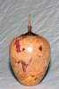
This is my third attempt at a hollow form. The red is "bright red inlace" from Woodcraft. I'm not sure what it is actually made from...lol. The hollow form is approximately 5 1/2" tall, 4 1/4" max diameter, 1" opening and the bottom is 1 3/8" in diameter. The wall starts at 1/8" at the opening and gradually increases to 1/4" on the sides and 1/2" on the bottom. The lid is made from black claro walnut and is 2 1/4" tall and 2" in diameter at the base. Please give me your honest critique.

Thanks, Ken
 

Attachments

  • Maple-Burl-Hollow-Form-with Finial 6.26.08.jpg
    Maple-Burl-Hollow-Form-with Finial 6.26.08.jpg
    46.8 KB · Views: 185
Joined
Oct 29, 2005
Messages
886
Likes
10
Location
wetter washington
Website
www.ralphandellen.us
Ken, impressed is the word of the day. If that's only your third attempt, you should do well, *#*, you should do great.

Often times, on an early piece, there would often be flat spots on the curve, if there are I can't see them. Very good.

The only thing I can quickly suggest is the curve appears off to me, that is it feels like it changes. It appears to be not a flowing curve.

If you can get a copy, Raffan has an (out of print) book on design, where he spends a lot of time on "the curve". If you can get a hold of a copy of that book, do so.

Now, Raffan is supposed to have a new book out in August that updates his theories on design, I look forward to seeing it and learning some more ideas

TTFN
Ralph
 

john lucas

AAW Forum Expert
Joined
Apr 26, 2004
Messages
8,352
Likes
3,607
Location
Cookeville, TN
Ken I have to agree. If this is your 3rd your way ahead of the game. My critic will be on what I call fine tuning rather than an overall critic. Overall it is excellent. The general shape is good but there seems to be an odd little bump about 1/3 to 1/2 the way down. That may be the photo because it doesn't look the same on the left side as it does on the right. perhaps a piece of posterboard rather than a wrinkled sheet would let us see the sides better.
Most people make the finials look clunky. Yours is very good. I would consider making the straight section going up to the top a long gradual taper getting a little narrower right below the tip. You have a great curve going from the Onion shape at the bottom but keeping the same diameter all the way to the tip sort of throws it off. I'm not sure exactly what I don't like about the sort of V shaped detail below the onion shape. It's OK, but I can't help but think some other shape would have been better. Perhaps a V that is balanced on both sides or perhaps a slight curve to the bottom of the V.
Again, I'm just being picky the same way I am when I do my own work. Overall it's a good piece, especially for being your 3rd. Keep up the good work.
 
Joined
Jun 27, 2005
Messages
173
Likes
0
Location
CarmelHighlands, California
What's referred to as a bump in the curve is really a discription of it being composed of two curves. Generally, there are no absolute rules, one wants the curve to be continuous.

While working on it, it's important to be able to accurately observe what is being produced. Sometimes white, black or colored board can be place below or behind the work and one's lighting adjusted so that the profile can clearly be seen.

It's often easier to see what is being produced by observing the side opposite to the side being cut.

Hope this helps, Malcolm Smith.
 
Joined
Dec 30, 2007
Messages
89
Likes
0
Location
Long Island & Ashe County, NC
"I just like it"

:D Stealing a line from Cindy Drozda & David Nittmann's symposium session,; siding with David as the "Right Brain" free spirit...

I just like it. I think the form is pleasing and the lid transitions well from the piece.

My only comment would be to practice getting a uniform wall thickness, especially on burls. If the stock was not kiln dried, which most burls are not, you can get checking or cracking if the walls are left uneven. (DAMHIKT)

Inlace is crushed mineral/stone. It is quite pricey and there are alternatives.

Keep up the great work!
 
Joined
Jul 18, 2006
Messages
643
Likes
2
Location
Central Florida
Looking good Ken.

Was the increase in wall thickness from top to bottom an intentional design, or did it just end up that way? What kind of hollowing tool(s) did you use?

How about a picture of the inside of the piece? Did you get it nice and smooth in there? (Not everyone thinks smooth interiors are important or worth the effort, but I do.)

How about a picture of the bottom. Again, lots of turners don't waste any time on the bottom of a piece, but a nicely turned or detailed bottom can really set a piece apart in a competiton or at a group show.

How did you finish the piece (sanding to ??? grit, finishing material and application technique?).


Ed
 
Last edited:

john lucas

AAW Forum Expert
Joined
Apr 26, 2004
Messages
8,352
Likes
3,607
Location
Cookeville, TN
Inlace isn't crushed mineral stone. It is an acrylic resin. You can get it with all sorts of crushed resins in it so that it looks like crushed stone. I've been using it since he first came out with the stuff. I like the black Inlace with either white chips or turquoise chips. Here is a source for all sorts of Inlace. He also has a wide range of metalic powders you can add to the Inlace or epoxy or even CA glue.
The clear Inlace with stirred in gold leaf is also great. White with Red chips is nice. The Inlace he calls Lacey is really great for filling holes in Cherry. It's just the right color.
http://www.turtlefeathers.net/
 
Joined
Jun 21, 2004
Messages
46
Likes
0
Hollow Form comments

Hi Ken,

I would prefer the top shoulder to be a smaller diam than that which is 1 or 2" below. It makes me think of having two waist lines. Study the eggs shape. Perhaps it would be valid to suggest that the fade from the waist to the top is too tentative?

There are 4 dominant colors in your work. Red, (yellow in the wood), (brown and white in the finial).
Color is really tricky We get excited about inlace and pick a pretty color. It should go with any color wood, right?

The decision to fill a void is flawed unless we consider other aspects - such as color, texture and the impact on grain when plugging in a smooth area.

You always have the option of enhancing/enlarging/altering the opening and leaving it. I have burned the edge of internal voids and an pleased with that.
Congrats on the piece and upon knowing to invite comments.
Richard
 

Steve Worcester

Admin Emeritus
Joined
Apr 9, 2004
Messages
2,694
Likes
97
Location
Plano, Texas
Website
www.turningwood.com
Thickness I wouldn't worry about too much in this stage. It will come in time with more experience. The thickness is probably related to apprehension. You are afraid to push the limit and go through it. Totally understandable. I would side with the others, I think the shape is good, but the curve is too fat, if you will. Keep the shoulder high and bring the height of the curve up. But then again, if it sells, it worked and if you liked it, and it is what you were trying to accomplish, what we say doesn't matter. We are arm chair turners at this point. Good job.

If you have dry maple, try bleaching it and the stark contrast of the white against the red will really make the red pop.
 
Back
Top