• It's time to cast your vote in the January 2025 Turning Challenge. (click here for details)
  • Conversations are now Direct Messages (click here for details)
  • Congratulations to Alan Weinberg for "Elm Burl Bowl" being selected as Turning of the Week for January 27, 2025 (click here for details)
  • Welcome new registering member. Your username must be your real First and Last name (for example: John Doe). "Screen names" and "handles" are not allowed and your registration will be deleted if you don't use your real name. Also, do not use all caps nor all lower case.

Seeking your opinion on these two photographs.

Odie

Panning for Montana gold, with Betsy, the mule!
TOTW Team
Joined
Dec 22, 2006
Messages
7,285
Likes
11,589
Location
Missoula, MT
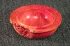
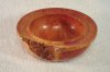
It looks like I may have discovered the reason why my bowls had a reddish cast to them in my photos.

I was shocked to see the difference in coloring of this Madrone burl bowl. The two photos were taken one after the other.....the only difference is the greenish rug was replaced with a white blanket for backdrop. No changes in camera settings, lighting, and no software adjustments of any kind......straight from the camera to your eyes.

I've been pretty stubborn about changing the green rug, because I've really liked the textured look to it.......now, I'll try to get something else, but in white, if this looks good to those on this forum.

OK......admittedly, I'm such a dummy with the camera, but there was nothing in the instructions that covered this aspect.......

What do you think? White backdrop look good to go?

I am aware that lighting still needs to be adjusted......have been experimenting with draping cloth over the bulbs, and positioning. I know I need to do something about the "hot spots", and I'm still working on that..........;)

thanks

ooc
 

Attachments

  • test 1.JPG
    test 1.JPG
    130.3 KB · Views: 138
  • test 2.JPG
    test 2.JPG
    86.6 KB · Views: 137
The issue is that your camera doesn't know that it's a green rug, so it's trying to make it neutral by adding red/magenta. That's the downside of automatic settings.

There may be a way to tell your camera what type of light source is in use, and have it not make the automatic assumptions.

I'll be happy to discuss this with you, offline, if you like. I was a commercial photographer for many years and have a wee bit of experience in this area.
 
I've been out in the shop for the past few hours.....working on a Cherry bowl! Thanks for the replies, Jim and Alan........

What would a grey backdrop accomplish? Would it be better than white or off-white? I can do that......I guess a grey paper from the art supply? I really do like the textured look, so another option is a fabric store/sewing center.......

Alan.......At this point, having that green rug isn't that important to me. I don't have much desire to learn about cameras, but I'm spending great amounts of time and energy learning/perfecting what I do love......making artistic bowls on the lathe.......I just want to be able to set up and take photos by using one method that works. Once I get that, I'm hoping I can do this over and over again, while using one basic set of settings to accomplish it.

Thank you.....

Gotta go to bed......been a long day, and tomorrow will be just as long!

ooc
 
Odie,

Changing to a neutral ("neutral" means that there is no color tint whether it is gray or white) background makes a world of difference in getting an accurate white balance from the camera's automatic white balance algorithm. Now, if I could convince you to not use a rug or towel, I think that you would see another quantum leap in photo quality. While you might like the texture and color of a particular rug, towel, tablecloth, quilt, shirt, or whatever, the subject of the photo is the turning and not the background. If I look at a photo and the background immediately grabs my attention, it means that I am looking at the background and not the turning. A completely featureless background would be the ideal thing to use.

Something else to think about -- the color of light. Our brains convince us that sunlight, florescent lighting, and incandescent lighting are all more or less the same color. In actuality, the color of these light sources vary all over the place and a camera doesn't have the brains to make them all appear the same (at least not without our help). On top of that, everything in the vicinity of the thing that we are photographing modifies the color of the light so that it is no longer the same as the light source. For example, a purpleheart bowl sitting on a white towel, will reflect purple color onto the towel close to the bottom of the bowl. Likewise a chartreuse rug will give the outside of a bowl a nice green color (assuming that you have turned auto white balance OFF -- otherwise, there is no telling what the camera's AWB will do).

Whether to use a white or neutral gray background depends on a lot of things, but for a casual photographer who is not interested in the huge investment in time to learn all the technical details, a medium gray is probably the simplest way to go.

What to use for a light source? Well, you can't beat the cost and spectral uniformity of of good old outdoor lighting. But, avoid direct sunlight because it creates shadows that are too harsh. Instead, go for "open shade" (open shade is defined as a shaded location that has an unobstructed view of the sky above.

Almost all digital cameras now have provisions for creating a custom white balance. It involves taking a picture of a sheet of plain white paper up close under the same lighting conditions that will be used for your photo shoot. Do not use the high priced "bright white" inkjet paper because it has UV brighteners.

There are a zillion other things, but this is sufficient to get you going.
 
I've been out in the shop for the past few hours.....working on a Cherry bowl! Thanks for the replies, Jim and Alan........

What would a grey backdrop accomplish? Would it be better than white or off-white? I can do that......I guess a grey paper from the art supply? I really do like the textured look, so another option is a fabric store/sewing center.......

Alan.......At this point, having that green rug isn't that important to me. I don't have much desire to learn about cameras, but I'm spending great amounts of time and energy learning/perfecting what I do love......making artistic bowls on the lathe.......I just want to be able to set up and take photos by using one method that works. Once I get that, I'm hoping I can do this over and over again, while using one basic set of settings to accomplish it.

Thank you.....

Gotta go to bed......been a long day, and tomorrow will be just as long!

ooc

Odie, A gray felt or other non reflective fabric works great. Your camera auto settings won't have to compete.
Check out this link from another woodturner and retired photographer. It will tell you all you need to know.
http://www.jamiedonaldsonwoodturner.com/files/phrugal.pdf
 
Would it be better than white or off-white? I can do that......I guess a grey paper from the art supply? I really do like the textured look, so another option is a fabric store/sewing center.......

Off white is not neutral. Unless you know how to post process an image to correct the white balance, avoid non-neutral backgrounds. There are also other reasons to avoid using non-neutral backgrounds.

A background should be just that -- unobtrusive and just sort of fades into the ... uh, background. Think of your turning as a prima donna that doesn't like to share the limelight -- especially not with a lowly background. There is a place for textures and patterns, but this isn't it.

Gray is good as a background because it reflects less light than white and doesn't modify the color of the light source.

Color management is becoming increasingly important for web images because of color aware browsers, monitors that have more accurate color profiles, and operating systems that support color management across applications.
 
Thank you Bill, and Jim for the additional information.

That looks like a great link, Jim......haven't had a chance to study it as yet, but I promise you that I will!

This backdrop was sent to me in a PM:
http://www.bhphotovideo.com/c/product/17747-REG/Flotone_GFT409_Graduated_Background_31x43_.html
Anyone used one of these? comments?

It looks like I'm just going to have to get with the program and do some re-thinking of my methods. Things are improving, but I'll muddle through this and come up with something better.

Again, thanks for putting up with my obstinate ways and leading this ol' horse to the water!

I just took a few pics of my shop a few minutes ago, and as you can see, I'm in a continuous state of "evolution" ......guess that's what everyone else does, as well! :D

The Harley is a 2000 FXDX......now has about 35,000 miles on it.

1992 Australian Woodfast.....the original.....bought new from CSUSA

Delta 1825rpm slow grinder, wolverine system

14 tool rests!

Bowls in various stages of seasoning, some are ready to turn.....and waiting for me!

A few more to follow

ooc
 

Attachments

  • 2000 FXDX.JPG
    2000 FXDX.JPG
    125.8 KB · Views: 56
  • 1992 Australian Woodfast.JPG
    1992 Australian Woodfast.JPG
    117.4 KB · Views: 57
  • Delta Grinder.JPG
    Delta Grinder.JPG
    141 KB · Views: 54
  • 14 tool rests.JPG
    14 tool rests.JPG
    131 KB · Views: 55
  • Bowl seasoning at work bench.JPG
    Bowl seasoning at work bench.JPG
    128.1 KB · Views: 54
Last edited:
continued.......

Wood purchased, but not touched.....as yet! :D

tool storage, wet grinder 10"

Tools in current use.......

ooc
 

Attachments

  • future bowls.JPG
    future bowls.JPG
    120.9 KB · Views: 41
  • Tool storage.JPG
    Tool storage.JPG
    125.5 KB · Views: 44
  • work area.JPG
    work area.JPG
    121.5 KB · Views: 44
Odie as for the backdrop paper, I tried to order one of those last year and they didn't have them in stock. Went to a local photo supply house and found a roll of gray, cost more but it was in stock. Got it home an built a PVC rack to hold the roll. Kept the box it came in so I can store it when not in use, as I can't keep the photo shop set up all the time.
Make sure to check with them to see if what you are wanting is in stock.
 
Odie, the Flotone thunder gray graduated background from B&H is what I almost always use for photographing turnings. There is a very similar product called Varitone, but I have not tried it. If I am photographing dark turnings, I sometimes use the Studio Gray graduated background from Flotone.

I like to make sure that the background is out of focus by using a lens with a moderately long focal length and shooting from a distance of about ten feet. Compact P&S cameras propably do not allow that luxery, but if your camera has optical telephoto capability (not digital telephoto), shoot at the longest available focal length and have the camera at a distance where the turning fills about half of the frame.

One other note -- when using the graduated background, the lighter end is at the bottom and the darker end is at the top. The object being photographed sits on the lower end of the background and the upper end sweeps back at about a 30 to 45 degree angle. You could make a curved "sweep" from a sheet of Formica to support the background.
 
I know either neutral grey or graduated grey is the commonly accepted backdrop that especially professional photographers use, but I (in keeping with my contrary nature) prefer to use black - usually black felt that sometimes will have drape lines. I believe it more focuses the viewer's attention onto the piece vs. the picture as a whole, but then that's just my opinion.
 

Attachments

  • 191 e small.JPG
    191 e small.JPG
    52.5 KB · Views: 24
  • 136 a small.JPG
    136 a small.JPG
    70 KB · Views: 24
Backgrounds should not take your eye away from the subject. That's why I prefer plain rather than textured. Not mentioned before is how much the object fills the frame. If you insist on using the Auto white balance setting every time you change woods the color will be different. If you use a gray background and have lots of back ground in the photo your colors will be closer. However if you crop fairly close the camera will see each color of wood and try to correct it to some neutral color and throw it off.
The same is true for black or white backgrounds. Some woods will look better on one or the other. White tends to reflect into the wood and if your work is glossy will show up as somewhat washed out areas. Black won't reflect light back into the underside of turnings which forces you to add more light to these areas. That can often make the bowl look flat.
The graduated back grounds look great and have a little of both qualities of light and dark and the added contrast. They are painted however and scratch very easily. They can also throw off the white balance setting in Auto.
For that reason alone you should use a consistent light source and set your white balance for that. For example use Tungsten lights and set the tungsten setting, or daylight and the daylight setting. By the way daylight varies a tremendous amount from morning to night, and even changes to blue if you are in shaded areas with no direct sun. For that reason I prefer to use my own lights.
I just started experimenting with color corrected FLD's. ( I used to teach with quartz halogen work lights that balance quite accurately with the tungsten setting) If you buy the FLD's go to photo suppliers and make sure they not only say 5000 to 5500K but also have a CRI index of 90 or above. Many of the bulbs don't list this CRI rating and your gambling on the color accuracy without it. I just got the first one and it's dead on color wise. I am ordering another lamp that has 3 bulbs for more power and comes with a reflector, umbrella, stand and diffuser. When I get all these set up and tested I'll post my results here. The daylight balanced FLD's should work better with the Auto setting but again you are much better off using the correct white balance, and in this case it's the Daylight direct sun setting.
 
John sounds like an old silver deposit guy. Use the temperature of the incident light, like we used to measure the intensity of the incident light, and the variations in color or reflectivity will be minimized.

While I'm sure there are web experts in the know here, I would use the temperature correction available in my photo software package to get something to "look right" on my monitor. Trouble is, it's good only for my monitor, not yours. It's also not good for someone else's printer, just mine. They all use software of their own liking, even when they are supposed to be using the "standard" from Aldus.

I wouldn't concern myself too much with eliminating background, either. There are more than enough pixels in today's average camera to make an acceptable web photo out of a quarter of the included area. I also wouldn't use the foreshortening telephoto, especially if I were providing the light. Inverse square rule and all. Not to mention the focal length/shooting distance/depth of field business was, I think, a wash between my 50mm and my 100mm macro back when. Is that true?
 
Having a consistent light source would be nice, but I have not found anything other than strobes that remain consistent over the long term. The trouble with flash is setting up the lighting for the right shadows, etc. My speedlites have modeling capability, but the modeling time is far too short for me. I like to spend minutes and not microseconds tweaking things.

It seems like CFL's shift significantly as they age and some of them cause quite a bit of metamerism-like color problems (i.e., two different things that have the same color under daylight look considerably different when using CFLs for digital photography).

For now, I am sticking with my 500W 4800K photofloods. They are sort of expensive and only last about 6 hours, but the initial investment is fairly low. I find that over a period of about 30 minutes, I need to check the WB several times. For this reason, I usually have a WB target near the edge of the frame that gets cropped out during post processing.
 
Bill I will let you know how the CFL's last. So far they are very true color wise. I compared them to my Speedotrons and also took a reading with our color meter.
I am a firm believer in getting the shot right first, then correct if necessary with your software. I've tried correcting after the fact and it's just not as good. Trust me I shoot in bad lighting situations every day and have to correct. We often have to shoot with very poor available light and then have to turn out an acceptable photo. There's nothing like getting it right or extremely close first. Not only does it save time but it's much easier to get the color correct.
I also shoot a tremendous amount of art work. I use long lenses. Most of the work I shoot is done with 100 to 200 mm lens. It gives it a more natural perspective. I do shoot certain work with normal to wide lenses for a certain look but mostly use the long lenses. They have another handy feature. Because the angle of view is less your background doesn't need to be as large. It will also throw the background more out of focus.
 
I have heard that some of the fancy broad spectrum fluorescent lights like Verilux use an assortment of phosphors to get a more uniform spectrum of lighting. If so, this would be good because the old basic T-12 cool white tubes have a horrible spectral content which consists mostly of small clusters of very "spikey" emissions and lots of "holes". I'll see if I can locate the chart on my PC that shows emission curves for various light sources.

I use about the same FL range as you do for shooting turnings. I have been using f/11, but think that I should go to f/16 because I sometimes find when it is too late to do anything about it that the DOF is too narrow on large diameter turnings.
 
Photographs

Odie,

The issue is a matter of one of your automatic camera settings probably "color balance". As pointed out earlier your camera will react by adding or subtracting color. This is important for a few reasons. One is that if you sell your work online or submit photos for acceptance into shows you want to present an accurate representation of your pieces. The other is that you do good work and should show it to the best of your ability.

Regardless of what you learn to fix it with this one turning remember that backgrounds are not "one size fits all" the same can be said with lighting.
 
Another place to buy the faded backgrounds is www.porters.com A little background on metering. Your meter looks at the whole scene but averages the color and exposure based somewhat on the center area. This varies a lot due to the sophisticated metering of modern cameras.
The reason I'm telling you this is that the background is only part of the metering and exposure setting of the camera. Consequently if you use the gray background but shoot an ebony bowl, a cherry bowl, and holly bowl the camera will change the exposure and color balance.
Because of the above situation I recommend using manual exposure and set the white balance to your lights. However I know most people won't do this. This is why a gray back ground is handy. Gray shows color shifts more than any other color. it makes it easier to color correct the final shot. You simply change the color until the gray looks gray. It takes practice because you can still get a red gray or blue gray if you don't have a patch sitting next to you. There are ways to get around this in photo shop but most people don't have that program.
A good way to do it is to put a known color chart of some sort in the scene. (I use either the Kodak chart or the McBeth color checker) Set the color to this and then adjust the same amount to each of the photos. For example if it takes 2 clicks of magenta and 1 of cyan to get the first photo right then do the same to the others. Your programs may not be sophisticated enough to do this.
Using the gray back ground will usually get you closer when in fully automatic modes. By the way, the graduated white to black backgrounds average out to about gray to the camera.
 
Thanks to all for the posts......I'm still absorbing some of this, and haven't spent any time with the camera for a few days. I'll return to this thread when I get motivated again.......! :D

ooc
 
Odie,

The issue is a matter of one of your automatic camera settings probably "color balance". As pointed out earlier your camera will react by adding or subtracting color. This is important for a few reasons. One is that if you sell your work online or submit photos for acceptance into shows you want to present an accurate representation of your pieces. The other is that you do good work and should show it to the best of your ability.

Regardless of what you learn to fix it with this one turning remember that backgrounds are not "one size fits all" the same can be said with lighting.

Yes, I am beginning to see and learn these things. Maybe someone here can relate.....but, I'm one who has a natural rejection of things like cameras. If you knew me, you'd realize I'm in another world......one which isn't shared by many. Heck, I don't even own a cell phone, and watch zero TV. If it wasn't a necessity to have a computer for this artistic venture, I probably wouldn't have one of those either!......I just barely get by with my minimal knowledge of computers! My sons are normal techno geeks of a different generation.....but, I've come from a much different past experience. Lathes, and tangible artistic influence.......now, those things are "old school". :D These things are a natural draw for someone like me.

It is not my intent to strive for perfection in my photography......maybe that's a downfall, but as I see it, photography is not a good substitute for having the subject matter in the viewer's hands. It is a necessity to have acceptable photographic representation of my bowls, but I'm close to maximum capacity in striving for what it is that does interest me. This isn't a hobby.......it is an artistic obsession for me. :eek:

Odie,

The other is that you do good work and should show it to the best of your ability.

Thank you for the compliment. I feel I'm in the presence of many great art talents and sources of knowledge on this forum......and, in this organization. As I've said before, the AAW forums have been of immense value to me personally........I have altered and revised my thinking on many lathe related things because of it. I spent close to twenty years being a complete recluse in my shop......and, some things needed to change, while other things seem like they are unique to me, and wouldn't change them at all......even though some of my "odd" techniques are completely against common thought and trends.

ooc
 
Last edited:
Odie I can relate. I can barely use my cell phone. I am the most illiterate computer person in our department. fortunately I have a lot of people I can ask to help answer questions.
I have of course studied cameras a lot since I have been a photographer for a long time, sold cameras for a while, did camera repair for a while, and have taught many classes. Working in Photo Services at a University I have to solve a lot of problems and answer a lot of questions. Between my Boss, my color printer and myself we have close to 100 years experience. One of us can usually answer a photo question.
The downside is, digital cameras have advanced and changed so rapidly that it is very hard to keep up with the changes and I don't even try to keep up with the models.
 
...The downside is, digital cameras have advanced and changed so rapidly that it is very hard to keep up with the changes and I don't even try to keep up with the models.

I agree with John (which is usually the safest course). A related aspect of this problem is that the feature set offered by camera models is rapidly diverging. That makes it very difficult to tell another photographer how to fix something because, unless you're familiar with the camera the other photographer is using, you don't know if the feature you'd use to fix the problem is even available on their camera -- or what the feature might be called or where it might be found in pages of menu options.

For example, with my camera I routinely address white balance issues by using my camera's manual white balance setting. [This involves placing a white card [the back of white business card will do) in front of the object I'm photographing and taking a "test" photograph of the object and white card. I then use the camera's cursor control to move the cursor over the white card and tell the camera that area of the test photograph is white. I then save the setting, remove the white card, and take perfectly color balanced pictures. As long as I don't change the lighting, I can take pictures of as many items as I want without needing to adjust the white balance setting.] Chiming in with "use your camera's manual white balance setting" is apt to be useless advice since many cameras no longer offer this feature. Same things true of advising someone to use a tighter aperture to increase the photo's depth of field -- many cameras no longer allow the user to set the aperture. Etc. Etc.
 
Back
Top