• January Turning Challenge: Thin-Stemmed Something! (click here for details)
  • Conversations are now Direct Messages (click here for details)
  • Congratulations to Scott Gordon for "Orb Ligneus" being selected as Turning of the Week for January 20, 2025 (click here for details)
  • Welcome new registering member. Your username must be your real First and Last name (for example: John Doe). "Screen names" and "handles" are not allowed and your registration will be deleted if you don't use your real name. Also, do not use all caps nor all lower case.

Help with photos...

Mark Hepburn

Artist & Chef
Joined
Mar 26, 2014
Messages
1,622
Likes
580
Location
Houma, Louisiana
Not that I don't have enough to worry about just turning the wood, I can't figure out how to take a good photo of it...

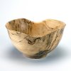
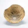
So if you'd take a look at these and maybe someone can help me with the weird shadows and odd exposure on these two photos? (I'm not calling out anyone in particular - but you experts know who you are 🙂)

I took this with my usual setup. The one that gives a blueish tinge to everything even though they're supposed to be 5500k CFL. 3 soft boxes - 1 as a key light, 2 fill lights: one above and just forward, the other at left and a bit farther than the key light.

Camera is tripod mounted and all the other photos I've posted use the same setup and I don't move the tripod.

Thanks!

002.jpg 003.jpg
 
spalted oak or spalted ash??????.....oak is usually spalted in sapwood.....have not turned much ash

what is your grind on doing the bottom of inside of bowl?????

sorry for no more of an answer......
 
Last edited:
spalted oak or spalted ash.....oak is usually spalted in sapwood.....have not turned much ash

what is your grind on doing the bottom of inside of bowl?????

sorry for no more of an answer......

That's okay Charlie. I don't have any answers either (for the photo). I'm using an Ellsworth grind 1/2" bowl gouge. I use his jig to sharpen and the nose is about 60 degree bevel angle. I haven't yet, but this week will be, grinding off the heel a bit on my gouges.
 
Mark,
1) Is there any post-processing done to the photos or are they “out of camera” jpegs? The shadow area around the foot looks as though it’s been lightened.
2) 5500k is on the bluish side; if you want warmer, adjust the color in post to 4750-5250k (depending on what you think looks good).
3) I find the lighting in the images to be too flat. The top light should probably be the brightest and then just one side fill that is just a tad less bright will help create some tonal variation and bring out the form of the bowl. Right now you are putting equal amounts of light from all angles, effectively flattening the subject.
4) I use a white to black gradient background. It helps create depth in the image.

The attached photo has only one overhead light and a bounced fill card at camera left.

_DCS5874_Final.jpg
 
I don't have a lot of problems with the shadows. Shadows are a product of form and light placement. Form is going to change with each vessel, so light placement may need to as well. You can also put a piece of white poster board on the front/side 0f the more s-acted area to bounce light to it and brighten that side up.
The color temp of most CFLs arent real accurate but changing it is easy in Lightroom or photoshop. I usually just do auto on the camera, or shoot a white card and set the balance in camera on each session.
 
Hi Mark......Lately, I've been putting some folds in the cloth backgrounds......and it gives my bowls a sense of placement. Don't know if that'll help.....but, given for some thought.....

ko
1410 claro walnut burl (4).JPG
 
I agree with the comment that you have too much light. It is not necessary to have light on all sides, a little fill (bounce off card) will do on the other side. I prefer gradient background also. I think the pros say no wrinkles in background, but mine is plastic so not easy to get wrinkle.
 
I think that you are making lighting overly complex by using three softboxes. I originally used two lights, but John Lucas convinced me to switch to a single light along with reflectors and gobos as needed to modify the lighting. One difficulty with multiple lights is that controlling shadows and highlights becomes overly complex compared to a single light set up.

I feel like the best way to get the color right is to do a custom white balance rather than using the camera setting and the color temperature rating marked on the lamps. The color of shadows being "off" can be the result of several things. With multiple lights in different locations, the color temperature might be different for each one especially if they aren't the same age. Another problem is unintended lighting such as room lighting or natural light coming through a window. Stray lighting is usually most obvious in odd colored shadows.

I have been using the WhiBal card for about eight years and it is reasonably priced. If you shoot JPG the card can be used to do an in-camera white balance. If you shoot RAW then you can do it in post processing, but in either case you need to take a white balance shot at the beginning of the shoot. I seem to recall that you have a WhiBal card so I think that it may be stray light that is the culprit. An alternate reference for white balance is to use a sheet of plain white Xerox copier paper, but do not use the high quality bright white ink-jet paper because it has UV brighteners that you camera sensor responds to differently than your eyes do.

If I find time, I will take a shot of the set-up that I am using. It's really simple with everything sitting on the floor. Anyway, I think that a single light is sufficient to give good lighting. You will need a tripod if you aren't already using one because the exposure time will typically range from one to five seconds long unless you have some really powerful lights. I am using a 500 Watt tungsten light, 4800K nominal color temperature. I stop the aperture down to about f/11 or so to get a decent depth of field and use a 70 - 200 mm telephoto zoom lens. I have the camera about ten feet from the piece and elevated about three feet.

I suspect that the reason for the bright light ring at the bottom is that you have a light aimed so that light is bouncing between the underside of the bowl and the background material. However, with some shapes it is just a natural effect. Blocking some of the ligh might help. When your color balance is set up correctly, the color of the shadow beneath the turning will be influenced by the color of the wood. Same thing applies if you use a colored background material ... it will distort the color of the wood on the underside of your turning. That is why you background out to be neutral (neutral in photography means has no color bias ... it is purely shades of gray ranging from black to white).

Just my preference, but the textured background may give you granular looking shadows and possibly be too reflective. I would go for a smooth background. If the background is too "interesting" people might look at it more than the turnings. 😀

One more thing, use the lowest ISO setting on your camera which is usually 100.
 
Last edited:
Mark,
1) Is there any post-processing done to the photos or are they “out of camera” jpegs? The shadow area around the foot looks as though it’s been lightened.
2) 5500k is on the bluish side; if you want warmer, adjust the color in post to 4750-5250k (depending on what you think looks good).
3) I find the lighting in the images to be too flat. The top light should probably be the brightest and then just one side fill that is just a tad less bright will help create some tonal variation and bring out the form of the bowl. Right now you are putting equal amounts of light from all angles, effectively flattening the subject.
4) I use a white to black gradient background. It helps create depth in the image.

The attached photo has only one overhead light and a bounced fill card at camera left.

View attachment 20326


Owen, thanks for checking in (I was hoping you, Bill, John and Steve might be around 🙂)

I did adjust in Lightroom. It seems no matter how I adjust my camera settings I can't get an "as shot" setting to work in LR. So, the auto setting brings the color temp up to 6100-ish, tone to +25 or so, and exposure to +.25 or so. My setup was three soft boxes in a room with one window that I used some dark curtains on to knock down the ambient light. Also, the only light source in the room is the studio lights.

So I changed last night to a top light and a 2nd light - I guess a key light you might say? - at front left in about the 7:00 position relative to the subject piece. It's pulled back about 3 - 4 feet from the table the background is on. I have a cheap reflector set (photo below) and I tried using it in dozens of different angles to try to bounce light from above onto the subject with basically no observable difference. Which is why I have the two lights instead of the top only. So for me to be able to use just a single light to achieve the same result should I ditch this reflector in favor of something else and if so, what would you say is the best way to go?

So, with the new setup, I took some shots of a small camphor bowl with shellac finish and these images are below. While I do seem improvement, They simply aren't in the same class. Highlights too bright, artifacts in the piece and the shadows, still looks flat to me, and so on. Also, the background is a photographer's backdrop in white vinyl, and not a cheap one, yet all my shots have a bluish tint. So is this the CR index of the bulbs in my lamps do you think? Is it bad camera settings or all of the above? 🙂

And thanks for your help (again)!


camphor bowl-1.jpg camphor bowl-3.jpg camphor bowl-2.jpg
 
I don't have a lot of problems with the shadows. Shadows are a product of form and light placement. Form is going to change with each vessel, so light placement may need to as well. You can also put a piece of white poster board on the front/side 0f the more s-acted area to bounce light to it and brighten that side up.
The color temp of most CFLs arent real accurate but changing it is easy in Lightroom or photoshop. I usually just do auto on the camera, or shoot a white card and set the balance in camera on each session.

Thanks Steve. Yes, it looks like these "photographer's CFLs" arent' all they're cracked up to be. Owen mentioned a bounce fill card and so you're just using a standard poster board? I hadn't even considered moving the lights once they were set. I've been shooting a gray card to get the camera white balance set and, even so, my images when I bring them into software for processing, have washed out contrast and seem somehow underexposed and yet overexposed at the same time.
 
Hi Mark......Lately, I've been putting some folds in the cloth backgrounds......and it gives my bowls a sense of placement. Don't know if that'll help.....but, given for some thought.....

ko
View attachment 20328

Odie, I really like the look for your work. It does make the bowl pop. I'm just not ready yet. I am still the grasshopper trying not to break the rice paper 🙂
 
I agree with the comment that you have too much light. It is not necessary to have light on all sides, a little fill (bounce off card) will do on the other side. I prefer gradient background also. I think the pros say no wrinkles in background, but mine is plastic so not easy to get wrinkle.

Hey Gerald, I'm about to immerse myself in the details of fill lighting and so on for sure. I think that I may bite the bullet and get a gradient background. I really admire Owen's photo in this thread (and Bill's also).
 
Way too many lights, Mark. I had originally used two lights, but switched to a single light and reflectors and gobos as needed to modify the lighting. It looks like you first need to get the white balance right and there are various targets to do that. Here are a couple that I use. My favorite is the one on the right. If you shoot JPG then you will need to do an in-camera white balance. If yo shoot RAW then you can do it in post processing, but in either case you need to take a white balance shot at the beginning of the shoot.

View attachment 20334

The card on the right is a WhiBal card and the one on the left is an x-rite passport which also is used to create custom camera color profiles, but for all practical purposes, especially showing on the web, that is way overkill. For I use it for a color-managed workflow that enables me to get high quality color printing (in other words, I spend more on photography than on woodturning 😀). You can also use a sheet of plain white Xerox copier paper, but do not use the high quality bright white ink-jet paper because it has UV brighteners that you camera sensor responds to differently than your eyes do.

Here is a shot of a turning using a single light shooting through an umbrella and a white reflector on the other side of the turning. I use a graduated background (Flotone Thunder Gray available from B&H and other places). My Yarn Bowl image in the gallery was also shot with this same set-up yesterday. Pay no attention to the finial. I stuck it on this lidded dish as a joke and took it to a club meeting where we had a challenge to turn something with a four inch finial. The lid actually has a small knob about an inch tall.

View attachment 20335
Also, don't pay any attention to the color temperature marked on a bulb. They are ballpark numbers and continually change as the bulb ages no matter if it is tungsten, CFL, LED, or a birthday cake with seventy candles. 😀 That's why you really need to use the white balance card to get a true white balance.

I will try to remember to get a shot of the set-up that I am using. It's really simple with everything sitting on the floor. Anyway, I think that a single light is sufficient to give good lighting. You will need a tripod if you aren't already using one because the exposure time will typically range from one to five seconds long unless yo have some really powerful lights. I am using a 500 Watt tungsten light here, 4800K nominal color temperature and the exposure time is 1.6 seconds. Stop down to about f/11 or so to get a decent depth of field and use a long lens if you have it. I am using a focal length of 148 mm for the above image. I have the camera about ten feet from the piece and elevated about three feet.

The reason for the bright light ring at the bottom is that you have a light aimed so that light is bouncing between the underside of the bowl and the background material. When your color balance is set up correctly, the color of the shadow beneath the turning will be influenced by the color of the wood. Same thing applies if you use a colored background material ... it will distort the color of the wood on the underside of your turning. That is why you background out to be neutral (neutral in photography means has no color bias ... it is purely shades of gray ranging from black to white).

Just my preference, but the textured background may give you granular looking shadows and possibly be too reflective. I would go for a smooth background. If the background is too "interesting" people might look at it more than the turnings.

One more thing, use the lowest ISO setting on your camera which is usually 100.

Bill, thanks for checking in also. Okay, so first things first. Love the finial. 🙂

I have that WhiBal card and took a shot with it before taking the photos above. I'm shooting RAW and bring into LR or PS CC. You mention using an umbrella. I would buy one in a heartbeat if they'll help with image quality and to reduce the harsh highlights I'm getting. Everything is on tripods.

Owen also said that I should be going for a lower color temp than the 5500k. I'm completely agnostic about the type of light so if tungsten, LED, whatever is superior, then that's the path for me.

On the camera settings, I'm going to have to dig in to the manual to really learn it's settings better. It's a SONY A3000, which I know isn't a DSLR quality camera but far better than what I was using and it's only purpose for me is shooting turnings. It has an 18-55 lens and 20x MP and I assume it's a CMOS sensor. If I need another lens, this camera will accept other lenses. For ISO and f/stop settings, I'm assuming that this will require me to use the camera in manual mode?

There's a consensus here that the gradient background is the way to go, and it's hard to argue with the obviously superior images. $35 at B&H with free shipping is hard to beat so I'm going to pull the trigger.

As to light bounce, I see that you and Owen are saying the same thing. Far too much light flooding the backdrop and from a bad angle. Back to the drawing board tonight.
 
Thanks Steve. Yes, it looks like these "photographer's CFLs" arent' all they're cracked up to be. Owen mentioned a bounce fill card and so you're just using a standard poster board? I hadn't even considered moving the lights once they were set. I've been shooting a gray card to get the camera white balance set and, even so, my images when I bring them into software for processing, have washed out contrast and seem somehow underexposed and yet overexposed at the same time.

Yes, you can use a white poster board, used it all the time when I did studio work.
You can't use a grey card for color temp. Most cameras will allow you to shoot a plain white paper or such, then go back and use it to set the white balance.
Grey card is to set standard exposure.

This was shot with 3 photo floods in a tent. 2x500 watts on either side and a 250 watt on top. Like Bill I use a graduated background, which mimics the falloff of light in a deeper studio arrangement. I generally use bounce cards in the front to lessen the shadows underneath
 

Attachments

  • image.jpeg
    image.jpeg
    109 KB · Views: 18
Bill, thanks for checking in also. Okay, so first things first. ....

I completely rewrote my post because it was late and I was half asleep last night when I wrote it. It seemed somewhat incoherent and rambling when I read it today. You don't need to buy lights with a different color temperature. If your lights are reasonably broad spectrum then you can use lights that have a color temperature of 2700K or 6500K or anything in between as long as you tell the camera (or PS/LR) what object in the image is truly neutral.

So, now I know that you are opening a shot of your WB card, using the eyedropper and clicking on the card in the image and then you will see what the real color temperature actually is as opposed to what the light bulbs say. My 500 watt hot lights drift all over creation before they poop out and fluorescent lights aren't any better. I suspect that LED lights aren't much better. I know that their light output does go down as they age.

Everything in an image alters the color of the light. Suppose you put red poster board all around the ash bowl. It would be like shining a red light on the bowl. Anything in the vicinity that isn't neutral gray will shift the color of the light that it reflects back. The tan color of the wood reflects that color onto the neutral gray background so the shadow won't be purely gray, it will have a slightly brownish gray color. If your background material is white or light gray, it will "shine" that white light on the underside of your turning and cause it to have a hazy washed out look especially if the wood is also very light colored. The shadow has a slight bit of blue tint and the white background also has a blue bias. There's no reason that you can't tweak the color temperature or bias values in PS/LR to tune out the blue. If you change anything, maybe a darker background along with just one softbox. Some white foamboard and black foamboard and I think that would be a good start.

So, why would a shadow look blue? Daylight coming through a window or blue walls or maybe the color that you see on your monitor is misadjusted. Maybe it's the background material. What are you using for a background. A lot of things today, especially fabrics are treated with optical brighteners that distort the way that camera sensors see a color.

It's not mandatory to have a wide gamut monitor that is calibrated regularly, but it makes it a lot easier to judge color. Speaking of monitors, most have three color temperature settings ... 5000K, 6500K, and 9000K. While hard-core graphics types in industry use 5000K, the rest of us would find it too warm, photographically speaking. Likewise, the bluish light at 9000K would seem too cool, but like Goldilocks, 6500K is just right.
 
If I may do a critique of the camphor bowl shots, the shadows ans background both seem neutral, and the exposure is good. I can see the reflection of a softbox in the images, but it is all but impossible to avoid seeing the light source in a glossy finish. The main distraction is some washing out of detail due to the bright background... notice how the edges of the bottom side of the bowl sort of fades to a white haze with an indistinct edge. Here are two solutions ... Illuminate the bowl without illuminating the background or a bit easier is to use a darker background. I think that the second works better.

BTW, reflections in a shiny object aren't bad ... how else would you convey something is glossy if it didn't reflect light? The big problem is controlling what gets reflected. Here is an example of reflections gone out of control so that is almost all that can be seen. It's my yarn bowl that I posted in the gallery, but for this shot, I took it outdoors and set it on a bench on the patio. I took the picture with my iPad and you can see the bench, sky, trees, grass, roof of house, iPad, and my chrome dome silhouette all in a fish-eye type reflection.

image.jpeg
 
I ordered the Flotone gradient backdrop from B&H. Shipped already this morning so props to them for that.

I reshot that camphor bowl using one light and a piece of poster board. The single softbox has dual lights in it. Used it full on, set up above, slightly to front and left of the object and about 30" or so above it. Used the poster board at back right slightly behind. The 3 photos show the image:

  • Photo 1: As shot in LR
  • Photo 2: Adjusted in LR to 4800k (eyedropper selected), exposure +.95, tone +27. The camera is set to ISO 100.
  • Photo 3: Brought into PS and used the auto settings for contrast, color and tone.
re-edit - 01.jpg re-edit - 02.jpg re-edit - 03.jpg


For me, the highlight is more pleasing (and the tool marks aren't :-D). Still got a looong way to go.

I'm going to try to find an online photo course or see if the local technical college has an evening course. In the meantime, any input on these and photos to folllow is much appreciated.

By the way Bill, even your iPad shot, distractions and all, is in my opinion better than my photos.
 
Rather than fixing the exposure in LR or PS, switch to manual exposure. From the EXIF data in your gallery shots I see that you are apparently shooting up close with a full open aperture and wide angle lens. On small pieces that is probably OK, but as pieces get larger, the fat nose effect becomes more apparent. If you have a long lens, like 70 mm or longer I think that it gives a more natural looking perspective on taller pieces and doesn't distort size as a function of distance.

I generally use my 70-200 mm zoom which gives me a lot of flexibility in camera placement. If you can zoom out to at least 55 mm on your current lens and move further away I think that you will see better results. When you use a longer FL lens, you probably know that the DOF decreases, so you will need to stop down the aperture to about f/11 to f/16. The much smaller aperture means that the exposure time will be much longer. I've had exposure times longer than four seconds occasionally, but with a sturdy tripod that's OK.

The exposure that your camera is calculating is being influenced by the white background. You can see that from the first picture above where it basically turned the white to middle gray If you do a high key shot with a white background then you ought to move the camera up really close so that the turning fills the frame for the purpose of getting an exposure reading. Have the aperture set to f/11 or smaller (smaller being a larger number) and ISO set to 100. Then move the camera back to its normal shooting location and using manual exposure set it for the same shutter speed. The goal is to get the exposure right in the camera so that you won't need to pull up the exposure in post processing. I usually wind up adjusting it anyway, but one full stop can sometimes create some undesirable noise.

As Steve said, the 18% gray card is for setting exposure and not for white balance. A lot of people use it for white balance and it's sort of OK in most situations, but I have seen too many gray cards that aren't truly neutral in color. If I can find some of my old gray cards, I might take a picture to show how different they are. Instead of getting an exposure off the turning as I described, a more precise method is to shoot a gray card to get the exposure. That will more accurately represent the luminance of the subject while shooting the object itself puts its luminance at middle gray. Sometimes that is a good thing especially if the wood is very dark and you want to see the figure in the wood.

Here is a nice tool in PS (and probably LR as well) that helps with an image that might be drab or flat looking. It increases the contrast along edges and give you flexibility on the width of the edge effects. Under Image > Adjustments select Shadows/Highlights ... See the image below for an example.

shadow-highlights.jpg

In the example above it looks a bit too dark after applying the Shadows/Highlights effect, but that is because I had already applied it when I converted the image so in this example it has been applied twice. I just wanted to emphasize how the tool works to give it a bit more contrast.

Abbreviations:
PS = Photoshop (not Elements)
LR = Lightroom
DOF = Depth of Field
EXIF = metadata about the camera settings
FL = focal length
f/n = ratio of entrance pupil diameter to lens focal length, usually called the aperture
ISO = sensitivity of the sensor. It is comparable to film sensitivity.
OK = acceptable, alright, fine and dandy, cool​
 
If you can, shoot in RAW, it will,have more exposure latitude.
The first photo is a bit underexposed, which is normal as the white gets read as %18 neutral gray. I tend to overexposed a bit to get the white as white.
Photo 3 looks best to me, I don't favor the blueish background.
 
I ordered the Flotone gradient backdrop from B&H. Shipped already this morning so props to them for that.

I reshot that camphor bowl using one light and a piece of poster board. The single softbox has dual lights in it. Used it full on, set up above, slightly to front and left of the object and about 30" or so above it. Used the poster board at back right slightly behind. The 3 photos show the image:
  • Photo 1: As shot in LR
  • Photo 2: Adjusted in LR to 4800k (eyedropper selected), exposure +.95, tone +27. The camera is set to ISO 100.
  • Photo 3: Brought into PS and used the auto settings for contrast, color and tone.
For me, the highlight is more pleasing (and the tool marks aren't :-D). Still got a looong way to go.

I'm going to try to find an online photo course or see if the local technical college has an evening course. In the meantime, any input on these and photos to folllow is much appreciated.

Much, much nicer photo than the ones posted with the beginning of the thread.

First, are you shooting in RAW or allowing the camera to make a jpeg? If you are using Lightroom, then RAW is a better option (“Copy” or “Copy as DNG”*) and you can export to jpeg for uploading and “publishing”. The latitudes of an image are maintained in RAW whereas jpeg has already eliminated some information from what the camera captured.

(*DNG is Adobe’s universal format for RAW files. It maintains the same information as the manufacturer’s RAW, just doesn’t have the limitation of being tied to Sony, Nikon, Canon, etc. software processing. “Copy” maintains the manufacturer RAW designation.)

2nd: The highlight on the back surface could probably be diminished if the light was placed at a higher elevation. One of the rules of shooting and editing is that a viewer’s eyes will be drawn to the brightest parts of an image. I think in this case, with the image already captured, the highlight brightness might be toned down a bit with the radial filter or adjustment brush in the Develop module.

3rd: The front of the bowl is soft on focus. I believe you are shooting with a “crop sensor” Sony and 18-55 zoom at f/3.5. If you have to shoot at 3.5 then focus on the forward lip of the bowl - it’s less distracting to viewers if the front edge of a subject is in focus rather than the back edge. If you can swing it, f/8 or f/11 would capture more depth of field (focus) than "open-er”; f/16 or f/22 runs the risk of bringing the background into focus which could add distraction to the image.

If you can send me the non-processed file, I’d be happy to see what it looks like in LR and offer post-processing suggestions.
 
Last edited:
If you can, shoot in RAW, it will,have more exposure latitude.
The first photo is a bit underexposed, which is normal as the white gets read as %18 neutral gray. I tend to overexposed a bit to get the white as white.
Photo 3 looks best to me, I don't favor the blueish background.

Steve, I'm shooting in RAW, sRGB color space. I don't care for that bluish tint either.
 
Much, much nicer photo than the ones posted with the beginning of the thread.

First, are you shooting in RAW or allowing the camera to make a jpeg? If you are using Lightroom, then RAW is a better option (“Copy” or “Copy as DNG”*) and you can export to jpeg for uploading and “publishing”. The latitudes of all an image are maintained in RAW whereas jpeg has already eliminated some information from what the camera captured.

(*DNG is Adobe’s universal format for RAW files. It maintains the same information as the manufacturer’s RAW, just doesn’t have the limitation of being tied to Sony, Nikon, Canon, etc. software processing. “Copy” maintains the manufacturer RAW designation.)

2nd: The highlight on the back surface could probably be diminished if the light was placed at a higher elevation. One of the rules of shooting and editing is that a viewer’s eyes will be drawn to the brightest parts of an image. I think in this case, with the image already captured, the highlight brightness might be toned down a bit with the radial filter or adjustment brush in the Develop module.

3rd: The front of the bowl is soft on focus. I believe you are shooting with a “crop sensor” Sony and 18-55 zoom at f/3.5. If you have to shoot at 3.5 then focus on the forward lip of the bowl - it’s less distracting to viewers if the front edge of a subject is in focus rather than the back edge. If you can swing it, f/8 or f/11 would capture more depth of field (focus) than "open-er”; f/16 or f/22 runs the risk of bringing the background into focus which could add distraction to the image.

If you can send me the non-processed file, I’d be happy to see what it looks like in LR and offer post-processing suggestions.

Thanks Owen. I'm shooting RAW. The camera generates an associated JPG with it as a separate file (I presume for previewing / thumbnail?). I use the RAW file in LightRoom and also PhotoShop.

Yes, it's a mirrorless camera with CMOS crop sensor 20.1 MP. Don't know the exact sensor size but...

I trashed all these files because I got distracted here at work and reformatted the SD card. Don't ask me why 🙂 I'll take more shots tonight and send an unprocessed image (and thanks very much, by the way).

I'm digging into the lens settings and capabilities tonight. It's a kit lens 18-55 that came with the camera. This is my first foray into photography beyond either a point and shoot, so I'm deep in hieroglyphics territory here. I do know that I can adjust the depth of field, and plan on moving the camera back, adjusting the focus and so on. We'll see how this goes.

I see what you mean about the focus being more on the back of the bowl than the front and to tell the truth, I didn't even pay attention at all. Not that I can tell anything by looking in the camera's display, but didn't even notice after bringing into Lightroom. That's a huge insight so thanks for that also.

I'll re-post with new images and settings information. I'm sure that everyone is waiting with bated breath 🙂
 
Rather than fixing the exposure in LR or PS, switch to manual exposure. From the EXIF data in your gallery shots I see that you are apparently shooting up close with a full open aperture and wide angle lens. On small pieces that is probably OK, but as pieces get larger, the fat nose effect becomes more apparent. If you have a long lens, like 70 mm or longer I think that it gives a more natural looking perspective on taller pieces and doesn't distort size as a function of distance.

I generally use my 70-200 mm zoom which gives me a lot of flexibility in camera placement. If you can zoom out to at least 55 mm on your current lens and move further away I think that you will see better results. When you use a longer FL lens, you probably know that the DOF decreases, so you will need to stop down the aperture to about f/11 to f/16. The much smaller aperture means that the exposure time will be much longer. I've had exposure times longer than four seconds occasionally, but with a sturdy tripod that's OK.

The exposure that your camera is calculating is being influenced by the white background. You can see that from the first picture above where it basically turned the white to middle gray If you do a high key shot with a white background then you ought to move the camera up really close so that the turning fills the frame for the purpose of getting an exposure reading. Have the aperture set to f/11 or smaller (smaller being a larger number) and ISO set to 100. Then move the camera back to its normal shooting location and using manual exposure set it for the same shutter speed. The goal is to get the exposure right in the camera so that you won't need to pull up the exposure in post processing. I usually wind up adjusting it anyway, but one full stop can sometimes create some undesirable noise.

As Steve said, the 18% gray card is for setting exposure and not for white balance. A lot of people use it for white balance and it's sort of OK in most situations, but I have seen too many gray cards that aren't truly neutral in color. If I can find some of my old gray cards, I might take a picture to show how different they are. Instead of getting an exposure off the turning as I described, a more precise method is to shoot a gray card to get the exposure. That will more accurately represent the luminance of the subject while shooting the object itself puts its luminance at middle gray. Sometimes that is a good thing especially if the wood is very dark and you want to see the figure in the wood.

Here is a nice tool in PS (and probably LR as well) that helps with an image that might be drab or flat looking. It increases the contrast along edges and give you flexibility on the width of the edge effects. Under Image > Adjustments select Shadows/Highlights ... See the image below for an example.

View attachment 20363

In the example above it looks a bit too dark after applying the Shadows/Highlights effect, but that is because I had already applied it when I converted the image so in this example it has been applied twice. I just wanted to emphasize how the tool works to give it a bit more contrast.

Abbreviations:
PS = Photoshop (not Elements)
LR = Lightroom
DOF = Depth of Field
EXIF = metadata about the camera settings
FL = focal length
f/n = ratio of entrance pupil diameter to lens focal length, usually called the aperture
ISO = sensitivity of the sensor. It is comparable to film sensitivity.
OK = acceptable, alright, fine and dandy, cool​

Bill,

Owen also suggests changing the aperture setting. Going to do this tonight when I re-shoot. Also, I only have the one kit lens (but fear that I may be in the photography vortex now, with all the expenditure that this inevitably entails). I can zoom out to 55 mm and set the stop as suggested. It's tripod mounted with a delay so I don't have any issues with long exposure times.

I see what you guys mean about the exposure setting and the effect of the white background. Every photo I take has to have the exposure bumped up in LR or PS.

I'm going to mess around with that tool after I have some "better" RAW shots to work with tomorrow.

Lots to digest. I really appreciate the help from all of you.
 
Thanks Owen. I'm shooting RAW. The camera generates an associated JPG with it as a separate file (I presume for previewing / thumbnail?). I use the RAW file in LightRoom and also PhotoShop.
_____
I'm digging into the lens settings and capabilities tonight. It's a kit lens 18-55 that came with the camera.

Yes, that’s right, when recording RAW that the camera makes a small jpeg for thumbs and the image review in the camera. The only basic setting I’d recommend changing is the color space; if you have the option choose AdobeRGB instead of sRGB. sRGB is primarily for the web and like jpeg cuts out some information from the capture. ProPhotoRGB is an even larger “color space” than AdobeRGB and the one I have set for my images. I go on the premise that it’s better to record as much information as possible and export only what’s needed.

There’s nothing wrong with your kit lens – I believe it’s the same lens my daughter uses on her Sony a6000 and it records great detail and color. To ease focusing, place a page of varying sizes of type at the same plane that you’d like to be sharp (a common position is 1/3 of the way from the front of what you want sharp to the back of what you want sharp) and focus on the paper. For your bowl, I’d place the paper, standing up, next to the bowl and about 1/3 of the bowl’s diameter from the front. Focus on that and do a test shot to examine focus on the screen. When it’s sufficiently sharp, remove the paper and swing the camera to compose the bowl as you desire.

You may already know this, so forgive me if it’s repetitive: the crop sensor digital cameras don’t have the same effective lens focal length as full-sensor and film 35mm cameras have. A 50mm lens on film is effectively a short telephoto (75mm equivalent) on crop sensor. Your seemingly very wide 18mm really has the same resulting image as a 28mm for full sensor and film — not so wide after all. For your bowl, I’d probably pull the camera back and start at 35mm to 50mm to limit some wide-angle distortion; this is equivalent to 52mm to 75mm on a film/full sensor camera.

Before upgrading to new equipment, I’d recommend exploring more with what you have. I think it was Bill who recommended using Manual settings and I agree. Digital is so forgiving with test shots — doesn’t cost any more $ to do a half dozen tests of focus, exposure, fill, etc. than it does shooting and then reshooting because you didn’t quite get it the first time around.
 
Last edited:
Well I'm late to this. The first thing I would do is to make your soft box narrower. At least if your going to shoot really glossy work. Take some paper of black cloth and mask off about a third or half so it's more of a strip light. Then rig up a way to be able to move the light where ever you want. I use a homemade boom arm. What you do is move the light around until you minimize the reflection of the light and if possible light more of the front. You can't always do both. The main light (soft box) should be positioned to give shape to the piece. It's not bad to see a reflection but it needs to show shape, how glossy the finish is, and at the same time not be too objectionable. Definiitely a challenge on glossy pieces. After you get the main light where you want it use a fill card to bounce light back in. If the fill card isn't working try moving the main light further away. This is a tough one to explain and i'll do it if someone really wants but if you move the main light further away and the fill card is in the exact same place you will get more fill. Has to do with light fall off. Anyway it works. However changing the fill card to something else like crinkled aluminum foil on cardboard or possibly even a mirror. Sometimes a second light is necessary but it should always be less bright than the first one.
Please don't use wrinkled cloth for background. OK sometimes it will set the piece off the background but if your entering juried shows nothing says amatuer more than photos shot on a wrinkled cloth back ground.
The funny ring around the base on the first photo is probably over sharpening. Been there done that. Either that or trying to use the contrast button too much in photo shop.
 
Some Information About Color Spaces
All digital cameras from cell phones to the digital backs on medium format cameras capture only one type of image and that is what we call a raw image. We say that a raw file is basically unprocessed data ... that's essentially true, but actually it does have to go through a conversion process known as demosaicing which results digital information in terms of red, green, and blue (RGB) values for each image pixel. The sensors in cameras are sensitive to a huge range of "light" from infra red to ultraviolet which far exceeds the human range of light sensitivity. No camera adjustments can change the way that the sensor responds to light. What the sensor records depends upon the light source. All of this is a roundabout way of saying that cameras at the basic level don't have a color space associated with what it records.

The place where color spaces come into play is when this basic raw data gets converted into a form that can be viewed on a display or printed. Owen mentioned three of the most common color spaces: sRGB, AdobeRGB, and ProPhotoRGB. If you are shooting JPG, what is really happening is that the camera is taking the raw image data that it captured and processing it to produce an image that you can see. As a part of this processing, a color profile gets assigned. The profile is important because it tells all devices used to display or print it how colors are to be interpreted relative to a known standard: the color profile profile that is a part of the metadata embedded in the image.

Raw image files, as I mentioned don't have color profiles associated with them, but as a part of the conversion process (Adobe Camera Raw is one example) to a viewable image you must assign a color profile. Owen prefers ProPhotoRGB and so do I. The advantage of using this huge color space is that you aren't discarding any human-visible data during the initial conversion process. If you choose instead to use sRGB, you may wind up converting out-of-gamut colors to the nearest in-gamut color. Why is that bad? Because when that happens, all of the image details in a particular color will be wiped out as it becomes an area of just a single color.

Eventually, you will likely convert the color profile of an image to the sRGB color space ... that is necessary for displaying on the web where sRGB is by default, the de facto standard. I'm a believer in late binding in color management. What does that mean? Binding refers to converting the image color profile to one that is appropriate for the destination color profile. Late binding means setting the destination profile as the last step before saving the image. If it's a high end printer then AdobeRGB is a likely choice to the destination color profile. If the end use is for web display or printing on a basic printer then sRGB would be the destination color profile.
 
Yes, that’s right, when recording RAW that the camera makes a small jpeg for thumbs and the image review in the camera. The only basic setting I’d recommend changing is the color space; if you have the option choose AdobeRGB instead of sRGB. sRGB is primarily for the web and like jpeg cuts out some information from the capture. ProPhotoRGB is an even larger “color space” than AdobeRGB and the one I have set for my images. I go on the premise that it’s better to record as much information as possible and export only what’s needed.

The camera does have either AdobeRGB as the other option. Chose that one. Makes sense and I'll just output to sRGB space for web use. I literally never print but it can't hurt to just have the information in the image file, as you say.

There’s nothing wrong with your kit lens – I believe it’s the same lens my daughter uses on her Sony a6000 and it records great detail and color. To ease focusing, place a page of varying sizes of type at the same plane that you’d like to be sharp (a common position is 1/3 of the way from the front of what you want sharp to the back of what you want sharp) and focus on the paper. For your bowl, I’d place the paper, standing up, next to the bowl and about 1/3 of the bowl’s diameter from the front. Focus on that and do a test shot to examine focus on the screen. When it’s sufficiently sharp, remove the paper and swing the camera to compose the bowl as you desire.
That's good to know. I spent a while last night looking at lenses, decided that I needed a different camera to go with it, and that led to a few comparisons of mirrorless vs DSLR, and then some tutorials, and youtube and well, you know how it goes. I had already chosen a Nikon D3300 with a 2 lens kit. Your timing was perfect and pulled me back from the ledge - the one where I spend another $900 or so and then have to sell my first-born grandson. And, I know that's maybe the cost of a decent single lens. 🙂

So I've been poking around in the camera settings. Unfortunately, the manual is not geared toward someone who is trying to learn anything beyond basics and finding more good information will be a project.

You may already know this, so forgive me if it’s repetitive: the crop sensor digital cameras don’t have the same effective lens focal length as full-sensor and film 35mm cameras have. A 50mm lens on film is effectively a short telephoto (75mm equivalent) on crop sensor. Your seemingly very wide 18mm really has the same resulting image as a 28mm for full sensor and film — not so wide after all. For your bowl, I’d probably pull the camera back and start at 35mm to 50mm to limit some wide-angle distortion; this is equivalent to 52mm to 75mm on a film/full sensor camera.

You can never go wrong by assuming that I DON"T know something. 🙂 I'm still working through the whole basics of photography and sensor size relative to other camera dynamics and didn't know.

Before upgrading to new equipment, I’d recommend exploring more with what you have. I think it was Bill who recommended using Manual settings and I agree. Digital is so forgiving with test shots — doesn’t cost any more $ to do a half dozen tests of focus, exposure, fill, etc. than it does shooting and then reshooting because you didn’t quite get it the first time around.

Bill did say go with manual settings and so I think that I have achieved this with my a3000. The interface is not intuitive and there are multiple steps to get to full manual settings.

On a separate note, how do I send you a file? Do you know if it can be attached to a "conversation"? I tried to just post it here in the thread for download but there are file type restrictions - appropriately so, now that I think of it.

Here is an unprocessed jpg (other than cropping) as well as a screen shot of LR. I pulled the light up and used a bounce card for fill at bottom right rear. Still working on that; it's a real art to getting that right.

Going to take a photo of my setup to post too. Thanks again!

camphor bowl - single light -1.jpg

LR screencap.jpg
 
Last edited:
Well I'm late to this. The first thing I would do is to make your soft box narrower. At least if your going to shoot really glossy work. Take some paper of black cloth and mask off about a third or half so it's more of a strip light. Then rig up a way to be able to move the light where ever you want. I use a homemade boom arm.

Hi John. I have a smaller soft box too with a single light instead of the dual lights. Which one would you use for this? I have a tripod with boom extension but it's inexpensive and somewhat limited with this big soft box. Perhaps I could put a smaller on on the boom (although I have it cantilevered).

What you do is move the light around until you minimize the reflection of the light and if possible light more of the front. You can't always do both. The main light (soft box) should be positioned to give shape to the piece. It's not bad to see a reflection but it needs to show shape, how glossy the finish is, and at the same time not be too objectionable. Definiitely a challenge on glossy pieces. After you get the main light where you want it use a fill card to bounce light back in. If the fill card isn't working try moving the main light further away. This is a tough one to explain and i'll do it if someone really wants but if you move the main light further away and the fill card is in the exact same place you will get more fill. Has to do with light fall off. Anyway it works.

In the posted photo, I did as Owen recommended and moved the light further away. I also pulled back the camera as Bill and Owen both suggested and set the lens at 55 mm - its max. Use manual focus (me and my trifocals through an EVF 🙂

However changing the fill card to something else like crinkled aluminum foil on cardboard or possibly even a mirror. Sometimes a second light is necessary but it should always be less bright than the first one.

The funny ring around the base on the first photo is probably over sharpening. Been there done that. Either that or trying to use the contrast button too much in photo shop.

I have a cheap collapsible circular reflector with white, silver metallic and gold metallic. Would that silver surface be what your thinking, or does the crinkled foil soften the light more? But does it change the white balance and do I need to factor this in?

I'll tell you, I'm really struggling with the relationships among the shutter speed, focal length, ISO setting, color temp, light levels, and so on. But I'm probably going to obsess on this until I have an "aha" moment and who knows when that will be?

😀
 
Some Information About Color Spaces
All digital cameras from cell phones to the digital backs on medium format cameras capture only one type of image and that is what we call a raw image. We say that a raw file is basically unprocessed data ... that's essentially true, but actually it does have to go through a conversion process known as demosaicing which results digital information in terms of red, green, and blue (RGB) values for each image pixel. The sensors in cameras are sensitive to a huge range of "light" from infra red to ultraviolet which far exceeds the human range of light sensitivity. No camera adjustments can change the way that the sensor responds to light. What the sensor records depends upon the light source. All of this is a roundabout way of saying that cameras at the basic level don't have a color space associated with what it records.

The place where color spaces come into play is when this basic raw data gets converted into a form that can be viewed on a display or printed. Owen mentioned three of the most common color spaces: sRGB, AdobeRGB, and ProPhotoRGB. If you are shooting JPG, what is really happening is that the camera is taking the raw image data that it captured and processing it to produce an image that you can see. As a part of this processing, a color profile gets assigned. The profile is important because it tells all devices used to display or print it how colors are to be interpreted relative to a known standard: the color profile profile that is a part of the metadata embedded in the image.

Raw image files, as I mentioned don't have color profiles associated with them, but as a part of the conversion process (Adobe Camera Raw is one example) to a viewable image you must assign a color profile. Owen prefers ProPhotoRGB and so do I. The advantage of using this huge color space is that you aren't discarding any human-visible data during the initial conversion process. If you choose instead to use sRGB, you may wind up converting out-of-gamut colors to the nearest in-gamut color. Why is that bad? Because when that happens, all of the image details in a particular color will be wiped out as it becomes an area of just a single color.

Eventually, you will likely convert the color profile of an image to the sRGB color space ... that is necessary for displaying on the web where sRGB is by default, the de facto standard. I'm a believer in late binding in color management. What does that mean? Binding refers to converting the image color profile to one that is appropriate for the destination color profile. Late binding means setting the destination profile as the last step before saving the image. If it's a high end printer then AdobeRGB is a likely choice to the destination color profile. If the end use is for web display or printing on a basic printer then sRGB would be the destination color profile.

Bill, thanks for this. I've copied a bunch of suggestions from you, Owen and John to work on tonight. By the way, not much of a sleeper are you? 🙂

On the subject of RAW, and not really knowing, but it seems that this is almost like an open source standard for color information and other data that most color spaces are based upon for digital? Some years ago I did a bunch of vector-based work and used CorelDraw, the Windows alternative to Illustrator. I'd work in either CYMK or RGB depending on where I was sending the image, and Pantone reference colors. Correct me if I'm wrong, but seems like there are some parallels here.

Moving from point and shoot to more control and knowledge is inevitable for me. Looks like it will be a fun but frustrating journey. Good thing I tend to be a patient student. And thanks to you, Bill, Steve and John for all your help. It's amazing to be able to just ask a group of experts who are patient enough to invest their time and knowledge.
 
Last edited:
Raw image files, as I mentioned don't have color profiles associated with them, but as a part of the conversion process (Adobe Camera Raw is one example) to a viewable image you must assign a color profile. Owen prefers ProPhotoRGB and so do I. The advantage of using this huge color space is that you aren't discarding any human-visible data during the initial conversion process. If you choose instead to use sRGB, you may wind up converting out-of-gamut colors to the nearest in-gamut color. Why is that bad? Because when that happens, all of the image details in a particular color will be wiped out as it becomes an area of just a single color.

You are, of course, correct Bill. I sometimes forget that RAW is purely unprocessed, complete camera capture information that doesn’t have color space or a locked-in white balance.

Mark, that’s the beauty of RAW — as long as you have a good image processing app like Lightroom or Photoshop, you are in complete control for adjusting your images. Not to overwhelm you at this stage of the game, but you might want to download the Google NIK image plug-ins. They are now free and I often use Viveza, SilverEfex Pro, hdrEfex Pro for my images. They work with both Lightroom and Photoshop and offer some very targeted adjustment abilities - especially Viveza for this woodturning type of photo. Just do the download now and hold off on exploring until later on. Yeah, like that’s possible! 🙂
 
On the subject of RAW, and not really knowing, but it seems that this is almost like an open source standard for color information and other data that most color spaces are based upon for digital? Some years ago I did a bunch of vector-based work and used CorelDraw, the Windows alternative to Illustrator. I'd work in either CYMK or RGB depending on where I was sending the image, and Pantone reference colors. Correct me if I'm wrong, but seems like there are some parallels here.

Forgive me if I've already said this ... regarding setting your camera to record in sRGB or AdobeRGB, that only applies to JPG images created in the camera. When using the raw format, there is no associated color profile for those files so you can use either setting and get exactly the same results. The processing steps that I follow for my raw photos after downloading them from my camera to my computer are:
  • Using Adobe Bridge, I open the image in Camera Raw. I think that LR (Lightroom) has the equivalent of Bridge built in. I know it has the same raw converter as ACR (Adobe Camera Raw).
  • I have ACR set up so that it uses 16-bit files and ProPhotoRGB. This is where a color profile first gets assigned to the image, so this is the stage where setting the white balance must be done.
  • After editing in ACR, I export to PS (Photoshop).
  • In PS, I do any remaining editing like cropping, resizing, noise reduction, sharpening, bit depth reduction to 8 bits, and converting the image to the color profile appropriate for the final destination. Note that this time I convert from one color profile to another. This is different from assigning. If I were to assign a different profile to an image that already has a profile, it would make a mess of the colors.
  • If the final destination is for the web then I would convert to sRGB.
  • If I plan to print the image, I could still use sRGB, but since my printer is capable of printing a range of colors greater than sRGB, but nor quite as large as AdobeRGB, I normally choose the larger color profile for printing.
The three color profiles sRGB, AdobeRGB, and ProPhotoRGB are called device independent. Device independent profiles are used for things such as digital images and color graphics. The other type of color profile is for a specific piece of hardware like a monitor, scanner, or printer. The purpose of all these various profiles is to ensure that my monitor, scanner, and printer all agree with each other (as well as with the rest of the color managed world) about the appearance of mauve, puce, and vermilion as well as other un-guy colors.

Grand Central Station of color management for all of these various color profiles is one very important color model that resides in the computer operating system: CIELAB. I suppose that CIELAB could be called the color model of your eyeballs because it encompasses the full gamut of visible colors. The mathematical translation from one profile to another is performed by going through the color profile defined by the CIELAB model, L*a*b*. Unless you're geeky like me, that's about all that you will need to know to survive color management.

There are two schools of thought regarding the two sensor sizes used in DSLR cameras 36 mm X 24 mm (generally called "full frame" because it's about the same size as 35 mm film) and 22 mm X 15 mm (known as APS-C or colloquially as a "cropped frame" sensor). Owen mentioned the apparent magnification factor with APS-C sensors. I think that concept has its roots in the early days of DSLR cameras where the only sensor size available was the smaller APS-C which is a lot smallest than the frame size for film. So, how do you entice photographers to buy a camera That uses smaller "film"? Well, you can:
  1. Make the reduced field of view fill the viewfinder ... and
  2. Market it as being equivalent to magnifying the image
Well, that's OK if you want to use that analogy, but what if the 35 mm format had never existed .... or what if we shrink the sensor until it's infinitely small ... do we get infinite magnification? The answer to both questions is that focal length is purely a characteristic of lens design and sensor size can't change that. What you do gain with a full frame sensor is a broader field of view for a given lens and there is no denying that benefit. My perspective ... Look through the viewfinder and if you like what you see then press the shutter button and don't worry about it ... it's just a number.

I'm not certain if I could compare raw with an open source standard unless that means a continuously evolving standard. Each camera maker maintains trade secrets about the details of interpreting the data contained in their raw formats, but the they all use extensions of the TIFF file structure with proprietary headers so I would say open isn't the best way to describe it. Almost every DSLR camera model uses a slightly different sensor design than other models. A sensor consists of millions of light sensing elements called photodiodes arranged in rows and columns and each one is covered with a colored glass filter that is red, blue, or green. The performance of the photodiodes are influenced by numerous design characteristics as well as evolutionary advances in technology so the performance of the sensor in a new model camera won't be quite the same as it would be in an older model. That's the reason that third party vendors like Adode have to release updates to their raw conversion engine when new camera models are released.
 
Back
Top