• November Turning Challenge: Puahala Calabash! (click here for details)
  • Sign up for the AAW Forum Pre-Holiday Swap by Monday, November 4th (click here for details)
  • Congratulations to Ted Pelfrey for "Forest Floor" being selected as Turning of the Week for November 4, 2024 (click here for details)
  • Welcome new registering member. Your username must be your real First and Last name (for example: John Doe). "Screen names" and "handles" are not allowed and your registration will be deleted if you don't use your real name. Also, do not use all caps nor all lower case.
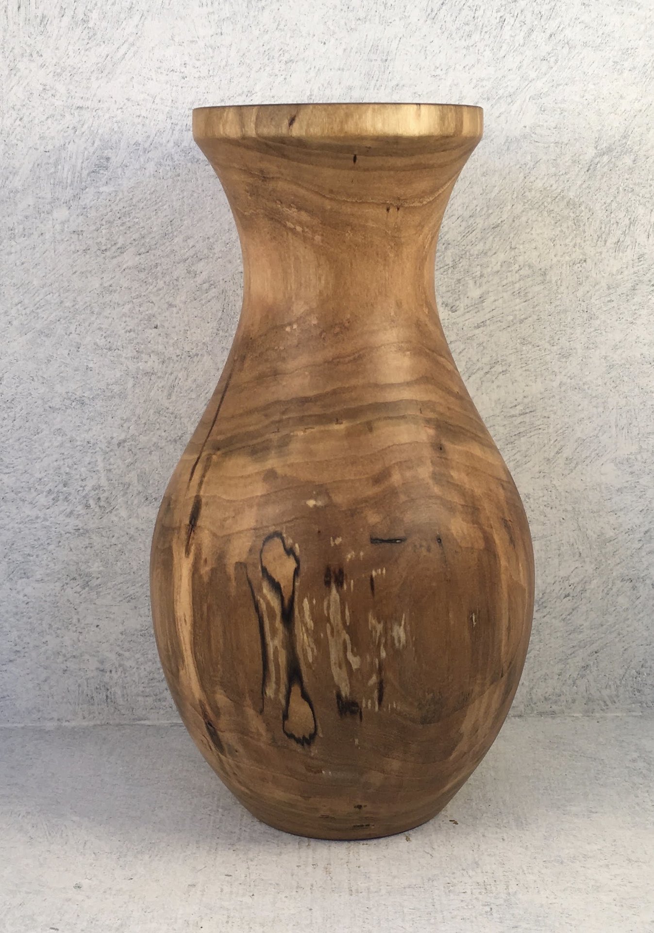
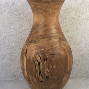
Black Cherry Vase
Randy Anderson

Black Cherry Vase

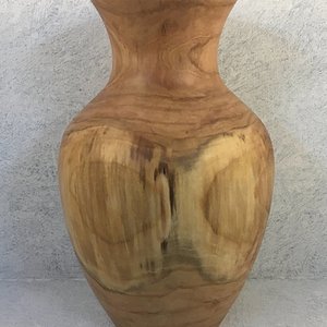
From a tree on my property that came down in an ice storm this past winter. As I mentioned in a post in the tips section I'm trying to focus on following different templates and patterns to vary my shapes and get my proportions right. This one is from a glass flower vase my wife keeps. 9" tall. I appreciate likes but, my friends and family will always say "that's nice". If you see something you would do different let me know. The top looks a little too wide to me, sometimes, then not. Maybe following glass or ceramic patterns requires a little modification?
I struggle with the same issues, Randy. I'm making some weed pots to give to family members along with some lavender I grew this summer, and when they're all done, I can see how they're not quite right, and maybe where to improve, but darned if I can do it while I'm turning, much less in the planning stage. I'm not sure there's any right brain in my head whatsoever.

With this one, the flat rim draws my eye, but doesn't please it. The next vase photo looks better in this way. And maybe a little narrower top, as you suggest. Or not. Gotta see it to know.
 
Dean, thanks and you're right. The flat around the lip draws your eye there away from the nice coloring in the vase. Funny, that wasn't part of my template but when I got there while turning I thought hmmm, looks kinda nice, leave it. It was lighter in color and blended in. Once sanded and oiled it stands out a lot more than it should. Oh well, next time.
 
The bottom the vessel has nice curves and form. As you proceed up the vessel, I think you could make the curve sharper at the shoulder, and narrow the neck and top. As a glass flower vase the form works as the wide mouth would allow the flowers to spread out and fill more space. As a pure wood form, the shape doesn't work as well and looks a little top heavy. In a perfect world, I'd also reduce or eliminate the vertical/square cut rim, but it might work just fine if narrowed.

As others have so frequently commented, I don't necessarily like critiquing others work, especially on forums, unless they have asked for it. Some will take offense when none is intended. Since you have asked, I hope my comments help.

Just another plug here, it would be nice to have a forum to submit work for critique. I learn much from comparing others' comments to my feelings about specific pieces.
 
Tim, thanks and I asked and want feedback. I've actually recently thought about asking if we can have a critique section to the forum. Post things knowing you're going to get critical feedback. It's the point. Like I said, family and friends will always say "that's nice". My local turning mentor is quick to tell me when he doesn't like something. It's a big help and necessary.
 

Media information

Category
Member Galleries
Added by
Randy Anderson
Date added
View count
553
Comment count
4
Rating
0.00 star(s) 0 ratings

Image metadata

Device
Apple iPhone SE (1st generation)
Aperture
ƒ/2.2
Focal length
4.2 mm
Exposure time
1/60 second(s)
ISO
25
Flash
Off, did not fire
Filename
IMG_6467.JPG
File size
489.1 KB
Date taken
Mon, 15 August 2022 7:56 AM
Dimensions
1677px x 2392px

Share this media

Back
Top