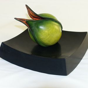
Congratulations to Paul May for "Staircase Study #1" being selected as Turning of the Week for November 11, 2024
(click here for details)
Welcome new registering member. Your username must be your real First and Last name (for example: John Doe). "Screen names" and "handles" are not allowed and your registration will be deleted if you don't use your real name. Also, do not use all caps nor all lower case.
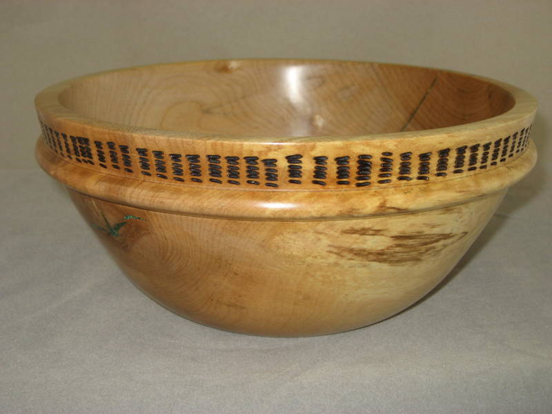
I normally don't critique, unless it's specifically asked for......so, I'll try it here, because you did. I feel uncomfortable doing this, because I know that everything we see in this AAW gallery is being shown because it reflects pride in the effort.
Your bowl shows a creative instinct......and overall, the design comes off nicely. It would improve the visual effect if the pyro marks were more uniform. The bowl wouldn't look so bulky and heavy if you had thinned it down some. Bowls used for utility ware need to be a little stronger and durable, but you still could have made this one slightly thinner......that would improve the overall look, while maintaining structural strength.
I see a little bit of green color on the left side......what is that?
This piece of wood doesn't have "stand alone" visual appeal, so it is a good one to make up the difference with a creative design. You did that, and I'm sure whoever ends up having this bowl will love it.
Please delete, if my comments are not what you had in mind.
This site uses cookies to help personalise content, tailor your experience and to keep you logged in if you register.
By continuing to use this site, you are consenting to our use of cookies.