• November Turning Challenge: Puahala Calabash! (click here for details)
  • Congratulations to Ted Pelfrey for "Forest Floor" being selected as Turning of the Week for November 4, 2024 (click here for details)
  • Welcome new registering member. Your username must be your real First and Last name (for example: John Doe). "Screen names" and "handles" are not allowed and your registration will be deleted if you don't use your real name. Also, do not use all caps nor all lower case.
3D Segments
J

3D Segments

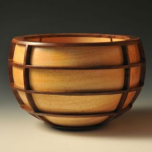
This is an idea I have been playing with for a while now. I have a few other designs I want to bring this concept to, but I had to make sure I could successfully have protruding elements going two different directions, so I kept the design fairly straight forward. I really wasn't sure I could pull it off, as there were many challenges with grain direction, alignment and clamping techniques.

It's not classical segmenting, instead the main body is turned as one bowl then deconstructed and reconstructed with the added elements.

It's about 4" x 6" White Ash and Maple.

Comments please. I would love feedback on the idea.
John.......

Congratulations on "turning of the week"......it's well deserved! :D

Up to this point, I've been reluctant to comment on this piece, because you are such a talented turner, and very accomplished. The work you've put into this piece is obviously very well done, and extensive.

Since you did ask for comment, I'll go ahead and give my suggestion on how this piece could have been better. I've seen nearly everything you've submitted, and everything looks to be extremely well done, and with a distinct individual artistic touch that comes from the "inner you"!

In my opinion, this piece, because the outer dark wood is such a complex design, looks a little "too much" in contrast to the inner lighter wood. This is where the artistic flavor is a little less than it could have been......IF the contrast between dark and light were not such drastic opposites.

I have seen you use light and dark themes a number of times before, (particularly in your "wave bowls"), and it always works excellently......but, with those, the design is much more simplistic and less complicated looking. Therefore, what looks great with a simple shape, may not be as effective when the overall design gets more complicated.......

John, hope you don't mind this input.......yes, I guess it is critical, but not meant to criticize! Again, you are definitely not a novice turner, and the experience you have, is reflected in the quality of your work.......

ooc
 

Media information

Category
Member Galleries
Added by
John Beaver
Date added
View count
8,244
Comment count
12
Rating
0.00 star(s) 0 ratings

Image metadata

Device
NIKON CORPORATION NIKON D300
Aperture
ƒ/8
Focal length
70.0 mm
Exposure time
1/1 second(s)
ISO
100
Filename
DSC_2563.jpg
File size
49.8 KB
Date taken
Fri, 13 July 2012 4:00 PM
Dimensions
1000px x 664px

Share this media

Back
Top