• November Turning Challenge: Puahala Calabash! (click here for details)
  • Sign up for the AAW Forum Pre-Holiday Swap by Monday, November 4th (click here for details)
  • Congratulations to Nino G. Cocchiarella for "Woven Seat Stool" being selected as Turning of the Week for October 28, 2024 (click here for details)
  • Welcome new registering member. Your username must be your real First and Last name (for example: John Doe). "Screen names" and "handles" are not allowed and your registration will be deleted if you don't use your real name. Also, do not use all caps nor all lower case.
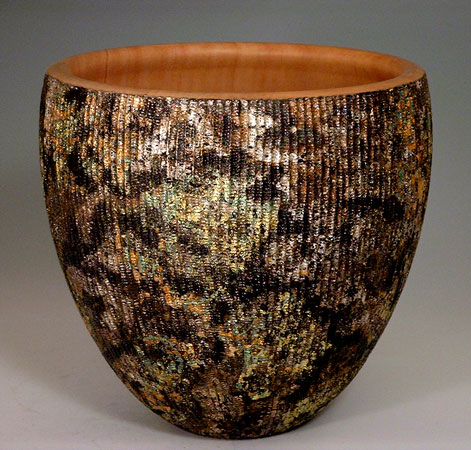
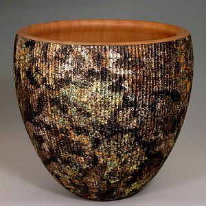
Alchemy
Step-3: Patination
A colorful patina was developed on the silver. This photo doesn't represent the color well--the yellows are golds, the greys are silver, the browns are hues of purple. this is one piece that needs good lighting!

All comments welcomed -- this is not what i invisioned, and i'm not certain what i think of it. the good news is that now i know what i want from the next piece.

Anyone have photographic suggestions on how to get truer color?
Experimentation is a great way to find new markets. I like the mottled and varied coloration on this piece. Plus the contrast with the natural wood interior is nice.
 
-e-, I think this came out really well. The combination of the natural wood interior, texture and color gives this piece a lot of visual and tactile interest. Being able to see the progression has been a lot of fun, too. How did you get the silver into the texturing? And how did you patinate the silver? I think this motif is definitely worth pursuing. I'm looking forward to seeing what you do with it.
 
hi pam and jeff -- thanks for the comments
pam- i apply guilding size to the piece with a brush; let it dry to tact (not sticky but not cured). the leaf is applied and carefully pressed into the brand-it stretches a tiny bit. with silver, i use potash sulfurated to get the varied colors.
 
thanks jim -- and thanks for your website review on the hvlp wagner -- just what i am needing to look into!
 
great job -e- ive enjoyed seeing the project come anlong. I dont know what you invisioned before you started but this is truly a keeper
 
thanks! ... after the holidays i'm going to workup another piece, hopefully closer to my 'vision'.
 
-e-, I'm rather late in this thread, but you asked about getting truer color in your digital images, and my suggestion is to make up a color bar in Photoshop or whatever image processing software you use--print it, and include it in the pictures so it can be cropped out after visually matching the digital image with the printed image using your software. Film photographers have used this method for ages, in fact photography stores (do they still exist?) sell an accurate color bar on an 8 x 10 card for this purpose. But you don't really need this, you only have to match up the print with it's likeness in the digital image.
Don't know if you'll even see this post but if you do, hope it helps.
 
-e-,
I recently joined this forum so I have much to see here. I love the texture and colors on this piece.

Ed
 

Media information

Category
Member Galleries
Added by
-e-
Date added
View count
11,447
Comment count
13
Rating
0.00 star(s) 0 ratings

Image metadata

Filename
48a.jpg
File size
78.3 KB
Dimensions
471px x 450px

Share this media

Back
Top