I'm working on a small lidded box basket illusion. We are using Faber-Castell Pitt artist pens for the coloring (my wife is doing the fine work). This is our first try at this. What are you using to finish your pieces?

-
We just finished moving the forums to a new hosting server. It looks like everything is functioning correctly but if you find a problem please report it in the Forum Technical Support Forum (click here) or email us at forum_moderator AT aawforum.org. Thanks! -
Beware of Counterfeit Woodturning Tools (click here for details) -
Johnathan Silwones is starting a new AAW chapter, Southern Alleghenies Woodturners, in Johnstown, PA. (click here for details) -
Congratulations to Dave Roberts for "2 Hats" being selected as Turning of the Week for April 22, 2024 (click here for details) -
Welcome new registering member. Your username must be your real First and Last name (for example: John Doe). "Screen names" and "handles" are not allowed and your registration will be deleted if you don't use your real name. Also, do not use all caps nor all lower case.
You are using an out of date browser. It may not display this or other websites correctly.
You should upgrade or use an alternative browser.
You should upgrade or use an alternative browser.
What finish do you use on a basket illusion?
- Thread starter John Rander
- Start date
- Joined
- Jan 27, 2005
- Messages
- 12,898
- Likes
- 5,188
- Location
- Dalworthington Gardens, TX
- Website
- pbase.com
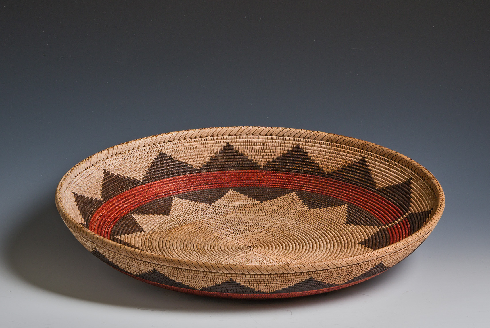
I use Copic inks to do the coloring, but I don't apply any clear finish because everything that I have tried ruins the natural look. What you use probably depends on the type of basket illusion that you want to make. My direction is creating a realistic illusion of native American coiled baskets in the style that Jim Adkins made famous although I do a few things a bit differently than he does. I also use star sanding disks to add wear and aging once the burning and coloring have been completed.
Another style of basket illusions are what I term mosaic beading ... the style that Harvey Meyer has made famous. I think that a fast drying clear coat is typically used on that style of basket illusion.
Here is an example of the type of basket illusion that I like to make.
Another style of basket illusions are what I term mosaic beading ... the style that Harvey Meyer has made famous. I think that a fast drying clear coat is typically used on that style of basket illusion.
Here is an example of the type of basket illusion that I like to make.
Bill, thanks for your reply; your example is beautiful. Your explanation is exactly why I asked. I'm afraid to give my small basket illusion a brilliant or plastic look. I started by watching Harvey Meyer's YouTube. Really quite a lot of information there, but I was looking for something closer to an illusion for this first piece. I have looked over your illusions, and then saw what Jean-Louis Meynier has done and his posts. He got me to Jim Adkins 2011 tutorial. I then looked over lots of Indian baskets via the web. So I'm doing what I can to follow that line as a start. We'll see if the patience holds out... 
So to the point, what finish would you put that would not be too flashy? I've thought of trying Danish oil, but not buffing. My test piece is in lime wood (which though soft beaded fine using the D-Way tools). I've put some sycamore maple aside for the next piece.
So to the point, what finish would you put that would not be too flashy? I've thought of trying Danish oil, but not buffing. My test piece is in lime wood (which though soft beaded fine using the D-Way tools). I've put some sycamore maple aside for the next piece.
Bill are you sure some shop gremlins did not sneak in and weave the top rim of that one . Love the look of space around the top adding depth to the weave.
I have done about 10 of the basket illusions so far. I use a couple of light coats of rattle can lacquer.
- Joined
- Jan 27, 2005
- Messages
- 12,898
- Likes
- 5,188
- Location
- Dalworthington Gardens, TX
- Website
- pbase.com
So to the point, what finish would you put that would not be too flashy? I've thought of trying Danish oil, but not buffing. My test piece is in lime wood (which though soft beaded fine using the D-Way tools). I've put some sycamore maple aside for the next piece.
I put an oil finish on the second piece that I made. I don't remember which brand, but they are all basically linseed oil, solvent, and a small amount of varnish.It made me sick to see how it ruined the piece. As any finish will do, it darkened the wood more than I liked, it added a bit of sheen which also ruined the look, it added some haziness due to the silica flattener that all satin and matte clear finishes use to reduce gloss, and worst of all the oil and solvent caused the colors to bleed. There's no way to undo a mess like that. I also didn't like the clear protective finishes such as Krylon Matte Workable Fixatif, and the acrylic protective finishes used to preserve photographs because they all caused a hazy sheen despite the advertising claims. The pieces that I have made are holding up just fine going au naturel. If you decide to apply anything, I would suggest nothing more than a very light application of a fast drying acrylic lacquer and most definitely stay away from any kind of oil or oil/varnish finish.
Thanks for the information. I was afraid of ruining the piece.
- Joined
- Jan 27, 2005
- Messages
- 12,898
- Likes
- 5,188
- Location
- Dalworthington Gardens, TX
- Website
- pbase.com
I would only experiment on practice pieces. There's too much work at stake to experiment on the real deal.
Thanks. As I progress on this first small piece I realize the amount of work invested. I must admit that it is magic to see the wood transform to "basket coil wraps". I am using small test pieces to try each step (like testing what setting for the pyrography pen, or what spacing looks "right").I would only experiment on practice pieces. There's too much work at stake to experiment on the real deal.
You could always turn a test piece out of pine and make pattern and color tests on this piece before making a mistake on your good one. We have a local truss company that gives away scrap pieces of dimensional pine lumber which I use for practice pieces, templates, molds and patterns etc.. Pine is really fast and easy to turn so you can quickly trial a new turning process on a test piece before you mess up on a good piece of wood.
There is a rattle can product by Testors called Dull Kote. It is a dead flat lacquer that I have used on things that needed protection but I didn't want any sheen. You would need to test with the Kopic pens or other things you use to color.
Thanks Mike for the suggestion; I do have a fair amount of scrap Norway spruce used in construction here which I use to explore new ideas. The problem is that pine doesn't bead well, burns-in at a different temperature setting for the OPTIMA pens, and doesn't absorb color in the same way. So my test pieces for this small project are in the same wood type. I've suspected that au naturel is the best option for the style I want, and Bill really confirmed that with his remarks. Frankly his work is beautiful. If this small piece works out (and my eyes & patience pass the test...), I may try something more ambitious for which I have put aside some sycamore maple. This first one is very educational...You could always turn a test piece out of pine and make pattern and color tests on this piece before making a mistake on your good one. We have a local truss company that gives away scrap pieces of dimensional pine lumber which I use for practice pieces, templates, molds and patterns etc.. Pine is really fast and easy to turn so you can quickly trial a new turning process on a test piece before you mess up on a good piece of wood.
- Joined
- Jan 27, 2005
- Messages
- 12,898
- Likes
- 5,188
- Location
- Dalworthington Gardens, TX
- Website
- pbase.com
I'll give away my other different approach to pyrography ... I don't burn the grooves between the beads. My reason for not burning the grooves is simple ... it isn't necessary because the natural shadows between the rows of beads look more realistic than the fake burned shadows. That's sort of an obvious statement, but it seems like everybody else does it probably because David Nittmann and Lincoln Sietzman did it that way. The downside to my approach is that it requires careful attention to making tight spacing between beads. I fine tune my beading tool by grinding the sides of the tool on the flat side of my Tormek stone so that I have very sharp points on the tool. This makes it sort of dangerous in the sense that it can quite easily rip up adjacent beads if I'm not careful when the tool touches the wood. This really gets hairy when the wood starts to warp a bit. For realism I like to make the baskets as thin as possible which almost guarantees it will warp a lot while being beaded.
That is why I practice on a Pine piece even when beading, when you switch to a good wood like maple the beading process is a snap! You can make all of the mistakes you want on a practice piece, sometimes you only have one shot at working a hard to source billet of wood. You can also turn a practice surface on a good piece of wood prior to hollowing for the final shape, this can provide for color testing and finish testing on the same type of wood.Thanks Mike for the suggestion; I do have a fair amount of scrap Norway spruce used in construction here which I use to explore new ideas. The problem is that pine doesn't bead well, burns-in at a different temperature setting for the OPTIMA pens, and doesn't absorb color in the same way. So my test pieces for this small project are in the same wood type. I've suspected that au naturel is the best option for the style I want, and Bill really confirmed that with his remarks. Frankly his work is beautiful. If this small piece works out (and my eyes & patience pass the test...), I may try something more ambitious for which I have put aside some sycamore maple. This first one is very educational...
Planning ahead can minimize many problems when turning new pieces or trying new techniques and finishes, no fun when you put a lot of labor and materials into a piece and then make a mistake while finishing the piece. When I start a new piece I always work the entire process out in my mind making sure I have all of the tools and materials needed to complete the project before I start. I plan work for a hundred millwrights and electricians each day so it is critical to visualize all of the work I plan to make sure I don't forget anything that will stop the work in process.
Thanks for the information. On this first piece I did burn the grooves lightly. I understand your point of view, and will try differently on the next one. I must admit that I'm reluctant to grind my new beading tools. Could you add a photo of what you have done?I'll give away my other different approach to pyrography ... I don't burn the grooves between the beads. My reason for not burning the grooves is simple ... it isn't necessary because the natural shadows between the rows of beads look more realistic than the fake burned shadows. That's sort of an obvious statement, but it seems like everybody else does it probably because David Nittmann and Lincoln Sietzman did it that way. The downside to my approach is that it requires careful attention to making tight spacing between beads. I fine tune my beading tool by grinding the sides of the tool on the flat side of my Tormek stone so that I have very sharp points on the tool. This makes it sort of dangerous in the sense that it can quite easily rip up adjacent beads if I'm not careful when the tool touches the wood. This really gets hairy when the wood starts to warp a bit. For realism I like to make the baskets as thin as possible which almost guarantees it will warp a lot while being beaded.
- Joined
- Jan 27, 2005
- Messages
- 12,898
- Likes
- 5,188
- Location
- Dalworthington Gardens, TX
- Website
- pbase.com
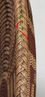
Here is an iPad photo that hopefully shows what I did. I certainly wouldn't try this on a dry grinder, but using a CBN wheel on a Tormek made it an easily controllable process. When I received the beading tools the edges at the top of the flute were not sharp so my goal was to grind the sides just enough to get the edges "borderline" sharp ... not quite sharp enough to draw blood, but almost.

Before sharpening the flute edges were rounded over and result in a wider space between beads than I want. For those who burn the grooves the wide space isn't a problem.
You probably already know this ... the grooves are usually burned by using something like a piece of phenolic or broken piece of Formica countertop pressed into the groove with the lathe running at high speed.
I used Faber Castell Pitt Artist Pen for coloring: Black, Sepia and Sanguine. I don't burn between the beads because I did a burning tip that imitates the stitches. For the finish I use Kryton Matte Finish (2 to 3 coats). I think it keeps the natural aspect of a native american basket. I did modify my D-Way 1/8" beading tool. I found that the original D-Way 1/8" beading tool created a too deep of a valley between the beads and increased my coloring time at the point of the stitches (Basket Illusion No. 5). I attached a pic of the 2 different beading tools.
Attachments
- Joined
- Jan 27, 2005
- Messages
- 12,898
- Likes
- 5,188
- Location
- Dalworthington Gardens, TX
- Website
- pbase.com
Jean-Louis, thanks for the pictures that do an excellent job of illustrating the modified beading tool. What you did is very similar to what I did. By grinding the sides I have made the flute not quite as deep. I have also done a small amount of honing inside the flute.
For coloring I have modified the Copic super fine tips by sanding them using P400 sandpaper to a very thin chisel point. This enables me to reach the bottom of the grooves. These modified tips wear out much faster than unmodified tips so I keep a large supply on hand because I might go through a half dozen of them on one basket.
Can you show a picture of your burning tip or is it still a trade secret?
Bill, It is not a trade secret. I am still improving them. Please see attached a PDF of what I am doing. I started in January 2018 for my Panamint basket illusion (No. 5). On my modified tool I maintained the 1/8" but I changed the angle of the edges of the flute.
Attachments
- Joined
- Jan 27, 2005
- Messages
- 12,898
- Likes
- 5,188
- Location
- Dalworthington Gardens, TX
- Website
- pbase.com
I use the Optima bead burning tip and have thought about doing something similar by bending the "horns" of the tip. However, my hands aren't as steady as they once were and my eyes have a hard time staying focused when I have been beading for a while. What you are doing requires very steady hands and sharp eyes. I think that the final results will be phenomenal.
Thanks for your sharing this. I wondered how you managed to burn those realistic wraps on your Basket Illusion No. 5.Bill, It is not a trade secret. I am still improving them. Please see attached a PDF of what I am doing. I started in January 2018 for my Panamint basket illusion (No. 5). On my modified tool I maintained the 1/8" but I changed the angle of the edges of the flute.
Bill, you mentioned using star sanding disks to add "wear and aging once the burning and coloring have been completed." Do you do this on all of your recent basket illusions? If so, what grit do you use for this? A light touch of 400 or something more serious?
- Joined
- Jan 27, 2005
- Messages
- 12,898
- Likes
- 5,188
- Location
- Dalworthington Gardens, TX
- Website
- pbase.com
Bill, you mentioned using star sanding disks to add "wear and aging once the burning and coloring have been completed." Do you do this on all of your recent basket illusions? If so, what grit do you use for this? A light touch of 400 or something more serious?
I think it was 220 or maybe 180. I try to use a light touch and keep to disk moving so that I don't go to completely bare wood. It's a lot easier to do a bit more sanding if necessary than it is to go overboard with the sanding and then repeat the burning and coloring.
Thanks. I'll have a look at this when I'm finishing up this first piece.I think it was 220 or maybe 180. I try to use a light touch and keep to disk moving so that I don't go to completely bare wood. It's a lot easier to do a bit more sanding if necessary than it is to go overboard with the sanding and then repeat the burning and coloring.
I would second Bill's comment. There are many different "tastes" in the basket work I've seen. I personally like the darkened look of using an oil and I often use darker woods. I use Watco danish oil, and after that has had a week or so to dry I spray two coats of Krylon acrylic matte finish and call it done. John, I see your location is France so you'll probably have to figure out which products are comparable. Getting the incredible detail with the coloring is something that takes a lot of practice. Don't be too frugal with the Faber Castelle pens. If you can't keep a good sharp writing tip on the brush point pens, use a new pen for the detail work and use the worn tips for filling in larger areas. The pens are relatively inexpensive compared to the time to fix mistakes. I've done about 20 of these and I haven't got there yet. But I will say that if the finish darkens the wood, it goes a ways toward hiding some of the imperfections. You can look at my album and see examples of what the oil does to the basket.I would only experiment on practice pieces. There's too much work at stake to experiment on the real deal.
Curtis, thanks for the info on your pieces. I'm just starting this and I find this small lidded box very educational (your recent lidded box gave me the idea to start with that form before trying a bowl). The Faber-Castell pens are great; the Superfine goes quite far into the recesses. However, I must admit that the scalpel has been useful for some corrections (obtaining precise hand movements is not easy). My wife wanted to do the coloring, she's younger and much more patient, but as a nurse she just hasn't had the time. As for living in France, yes I try to find equivalents when I can. However, the D-Way tools and Optima pens have no equivalents here, so I must order from the U.S. I appreciate all of the help from this forum to learn about the details.I would second Bill's comment. There are many different "tastes" in the basket work I've seen. I personally like the darkened look of using an oil and I often use darker woods. I use Watco danish oil, and after that has had a week or so to dry I spray two coats of Krylon acrylic matte finish and call it done. John, I see your location is France so you'll probably have to figure out which products are comparable. Getting the incredible detail with the coloring is something that takes a lot of practice. Don't be too frugal with the Faber Castelle pens. If you can't keep a good sharp writing tip on the brush point pens, use a new pen for the detail work and use the worn tips for filling in larger areas. The pens are relatively inexpensive compared to the time to fix mistakes. I've done about 20 of these and I haven't got there yet. But I will say that if the finish darkens the wood, it goes a ways toward hiding some of the imperfections. You can look at my album and see examples of what the oil does to the basket.
The Faber Castell brush pens are reversible. So when the original end gets fuzzy and wide, take a pair of needle nose pliers and pull it out and swap ends. The fine point pends are not reversible.
Thanks. Too bad the fine points are not reversible, as I have the impression that I'm using them a lot.The Faber Castell brush pens are reversible. So when the original end gets fuzzy and wide, take a pair of needle nose pliers and pull it out and swap ends. The fine point pends are not reversible.
- Joined
- Jan 27, 2005
- Messages
- 12,898
- Likes
- 5,188
- Location
- Dalworthington Gardens, TX
- Website
- pbase.com
If you can get Copic original pens in France they have the advantage of a selection of nibs from broad to very fine. The Copic original pens are refillable which make them much less expensive than disposable pens. There are other Copic pens that don't have this option or have a limited selection of nibs.
Even the very fine nib wasn't quite sharp enough for getting into the bottom of the narrow deep grooves so I tried modifying them and discovered that I could sharpen them with 400 grit sandpaper. I convert the round tip to a very sharp chisel shape. The nibs come in packs of 10 and I have a supply of several sizes and don't hesitate to modify them to suit my needs. They sell a special tool for pulling the nib out of the pen, but it is a well known secret in the tightwad community that a thumb and forefinger will work just as well if you don't mind a dab of ink on your fingers.
Even the very fine nib wasn't quite sharp enough for getting into the bottom of the narrow deep grooves so I tried modifying them and discovered that I could sharpen them with 400 grit sandpaper. I convert the round tip to a very sharp chisel shape. The nibs come in packs of 10 and I have a supply of several sizes and don't hesitate to modify them to suit my needs. They sell a special tool for pulling the nib out of the pen, but it is a well known secret in the tightwad community that a thumb and forefinger will work just as well if you don't mind a dab of ink on your fingers.
Everyone certainly develops their own technique. As has been said, the small brush tips are reversible and when you've worn both tips you can take a sharp pair of scissors and snip the frayed tip off for a new point. It's not quite as good as the original point but works well for some spots. My wife used to do custom calligraphy work and has a huge collection of dip pens and nibs. She has suggested I try some fine tip nibs but I haven't done it yet. If it works well I'll post my results.
Also, I posted a pic of a basket I did with black walnut as an example of using darker wood,
Also, I posted a pic of a basket I did with black walnut as an example of using darker wood,
Last edited:
- Joined
- Jan 27, 2005
- Messages
- 12,898
- Likes
- 5,188
- Location
- Dalworthington Gardens, TX
- Website
- pbase.com
I couldn't find any suitable maple turning blanks last fall to make a basket illusion piece for my club's Christmas banquet and auction so I used a piece of cherry. I was concerned about the wood turning dark, but so far it looks good. The cherry turned and beaded much much better than maple. Cherry also smells much better than maple.
john lucas
AAW Forum Expert
I haven't done a basket illusion yet but it seems to me that Krylon Fixatiff would be a great finish. It basically doesn't look like you put any finish on except that it will change the color of woods like Cedar and darken some other woods but for the most part on maple and woods like that it won't change a thing. It can be buffed to create a little more shine than dead matte if necessary.
Thanks John. Do you know if this spray is the same as the Krylon Matte Finish that Jean-Louis Meynier suggested (he uses this with the Faber-Castell pens)? These products are available here on the web, at twice the US price... I checked their site, but couldn't find out if this is acrylic varnish (equivalents here would be less expensive to test).I haven't done a basket illusion yet but it seems to me that Krylon Fixatiff would be a great finish. It basically doesn't look like you put any finish on except that it will change the color of woods like Cedar and darken some other woods but for the most part on maple and woods like that it won't change a thing. It can be buffed to create a little more shine than dead matte if necessary.
- Joined
- Jan 27, 2005
- Messages
- 12,898
- Likes
- 5,188
- Location
- Dalworthington Gardens, TX
- Website
- pbase.com
Thanks John. Do you know if this spray is the same as the Krylon Matte Finish that Jean-Louis Meynier suggested (he uses this with the Faber-Castell pens)? These products are available here on the web, at twice the US price... I checked their site, but couldn't find out if this is acrylic varnish (equivalents here would be less expensive to test).
Workable Fixatif is a soft finish that is often used as an intermediate layer when working with media such as chalk and charcoal which can smear if not protected. Matte finish is an acrylic lacquer finish that is intended to be a topcoat. However, I'll disagree with John about either one not affecting the final results. They both contain light scattering silica "optical flatterers" which, in effect, knock down contrast between tones ... which is a fancy way of saying it makes the results look hazy. If you're not the maker who sees both the before and after it might not be so obvious, but as the maker the change that these finishes cause are unacceptable to me.
Bill, thanks for following this. I appreciate your in depth arguments. I'm still waiting for an Optima pen delivery to complete the project, but I think it will be "au naturel" for now.Workable Fixatif is a soft finish that is often used as an intermediate layer when working with media such as chalk and charcoal which can smear if not protected. Matte finish is an acrylic lacquer finish that is intended to be a topcoat. However, I'll disagree with John about either one not affecting the final results. They both contain light scattering silica "optical flatterers" which, in effect, knock down contrast between tones ... which is a fancy way of saying it makes the results look hazy. If you're not the maker who sees both the before and after it might not be so obvious, but as the maker the change that these finishes cause are unacceptable to me.
On a different aspect of basket illusions, I am impressed by your herringbone wraps. Do you use a skew pen for that? I suppose you use a jig (sliced tube or similar) to sketch in the lines? Although not appropriate for this first project, I would like to learn the technique for something later. I suppose it takes quite a lot of practice to dare to use it to finish a project.
John, if you are an AAW member, you can view all the articles from past issues. One article is my Harvey Meyer and it shows how to do the herringbone. Allyn
Thanks Allyn, it was a good exercise to learn to use the search-able index, etc; I found the Harvey Meyer article "Basket Illusion Demystified" in October 2016, Vol 31, no 5, pages 36-44. Interesting article and a clear introduction to the herringbone. Bill has taken this a lot farther.John, if you are an AAW member, you can view all the articles from past issues. One article is my Harvey Meyer and it shows how to do the herringbone. Allyn
Jean-Louis, thanks for the pics, your method is quite clear... and the foie gras truffé (!!!) isn't a bad ideaJohn, I draw 2 temporary pencil lines (green) in the middle of the rim and then from these lines I burn the lines (red) as shown on the picture.
The spacing of the pencil lines will define the size of your herringbone pattern.
. I was sketching out a way to keep the motif "stable" when going around the rim, and your double green lines is a neat trick. The drinking straw "jig" looks very useful.